Automated Real Estate Agency
PWA | Project waits for 2nd round of investment (B2B, B2C)
A transformation of problems for a real estate agency into a digital solution with as much task automation as possible following user and business goals.
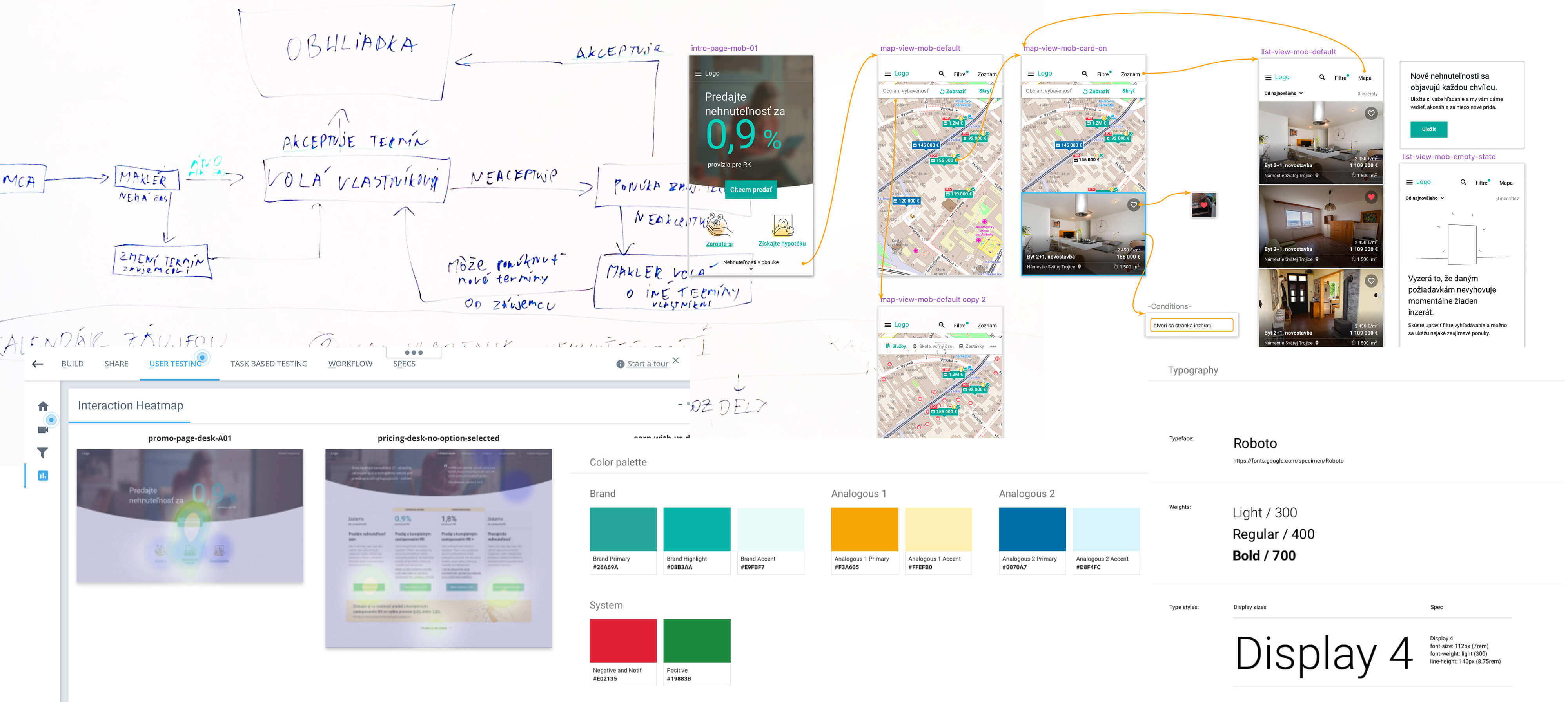
At the beginning of the project, I persuaded business stakeholders, developers, and potential users to take part in various workshops (using methods from Design Sprint 1.0). This allowed us to move fast and saved us from having a lot of unproductive discussions and hesitations breaking the momentum.
*To have a potential user creating with the cross-functional team what jobs need to be done was pretty eye-opening. Kudos to "Co-Creation: Designing With the User, For the User".
Discovery
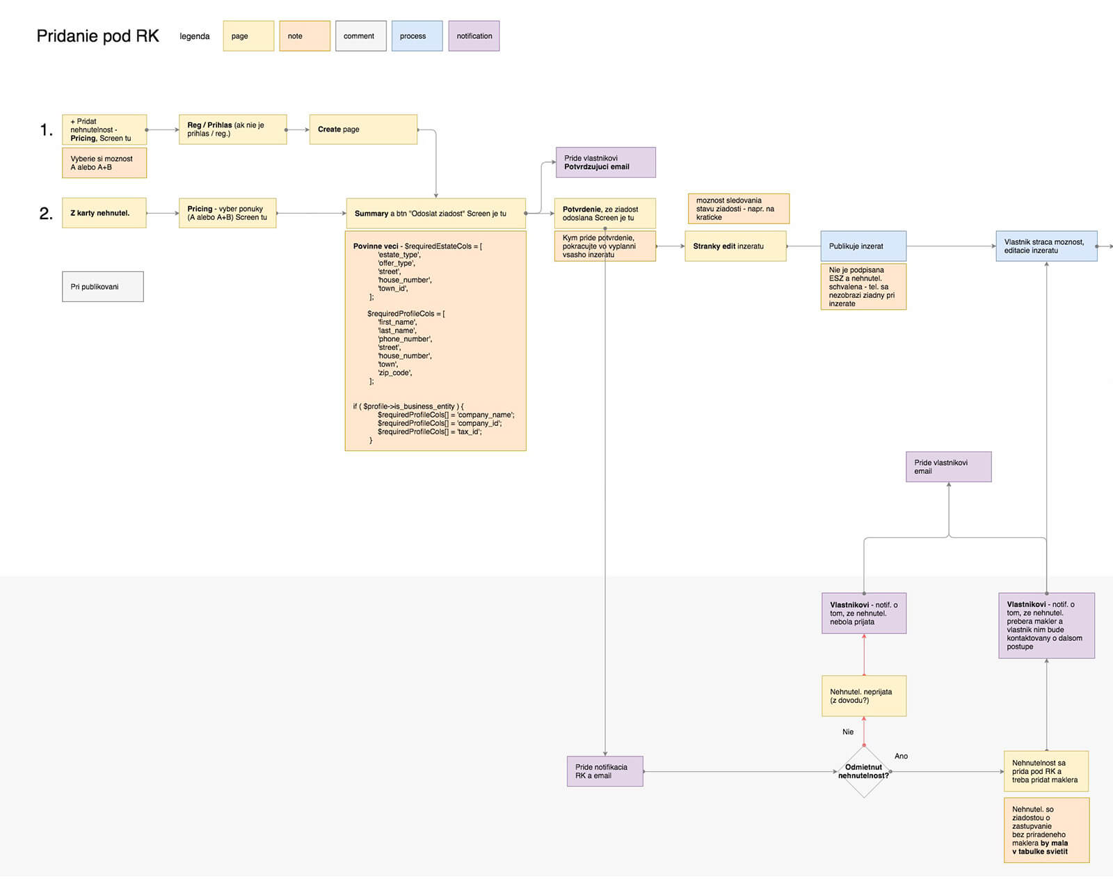
We merged data - the results of the client's internal research, my research, and sprint interviews. Using HWM (How Might We) note-taking and sorting them into Customer Journey Maps provided us with a holistic view on the Pains & potential Gains. To prioritize where to focus the Value/Effort Matrix was also used.
Ideation
During ideation workshops, we got inspired by
Lightning Demos and sketched possible solutions. After the
initial hassle with developers to start sketching their results
showed very innovative approaches.
Tip to unlock participants
for sketching: Ugly is ok and it is not a drawing competition
(Aj&Smart).
To have developers in the workshops showed useful especially here. They pointed a couple of problems with feasibility, e.g. syncing multiple in-app calendars of multiple user types.
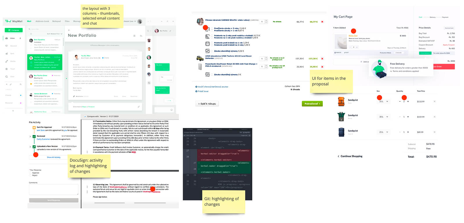
Example of Inspiration Board
Prototypes
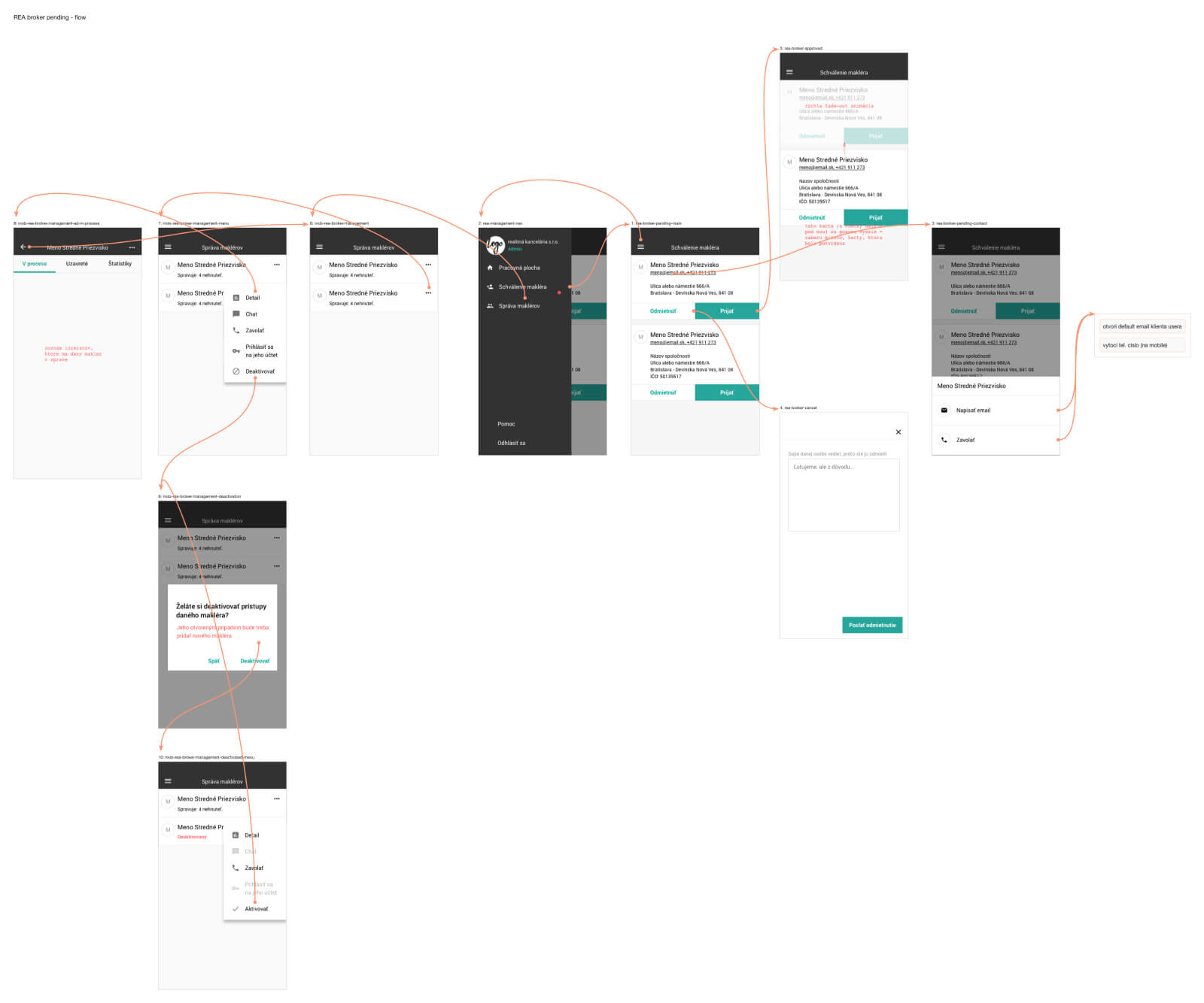
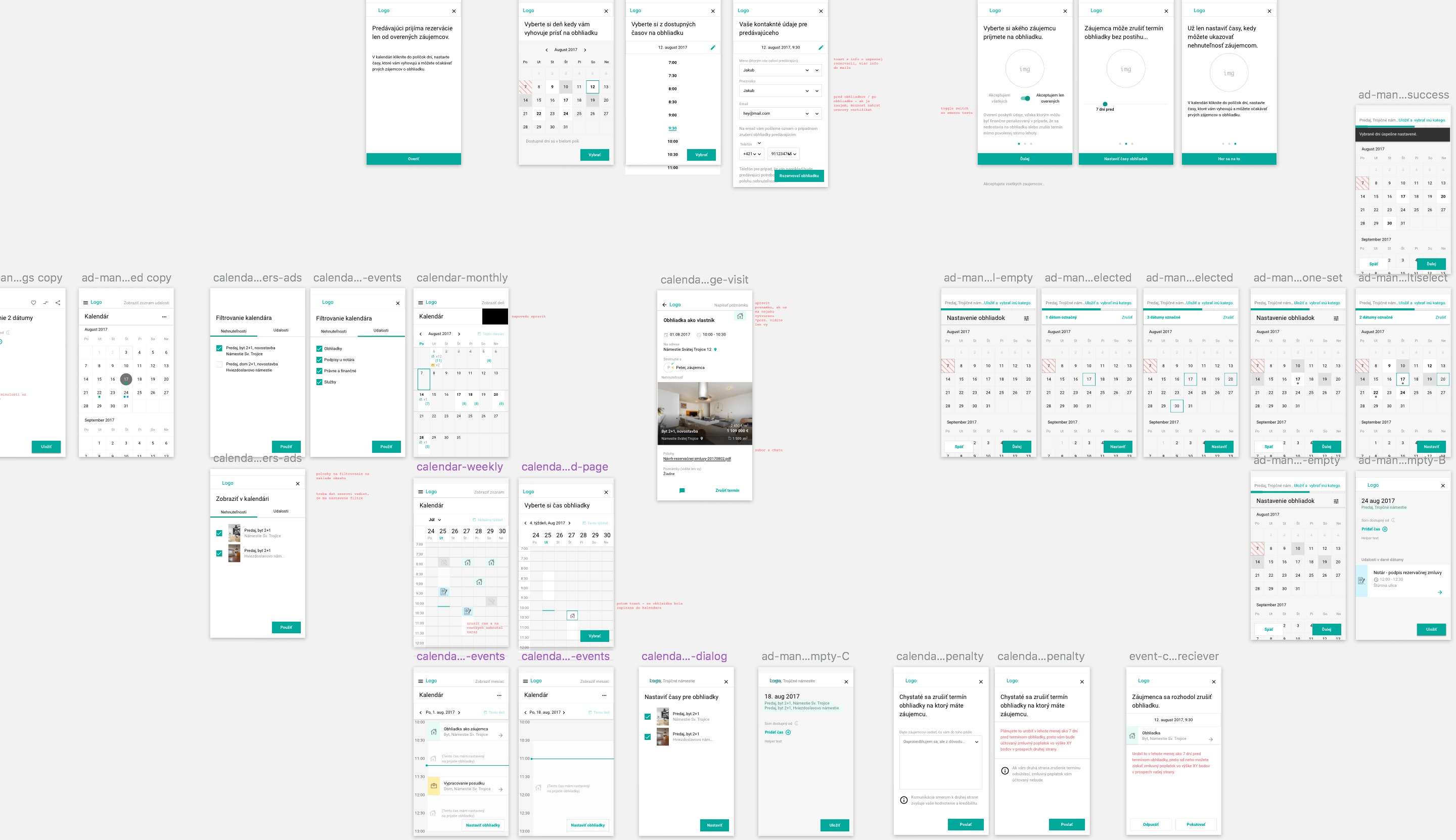
The Silent (Zen) Voting, Together-Alone principle allowed us to select the solutions, those we moved into the prototyping phase.
Validation
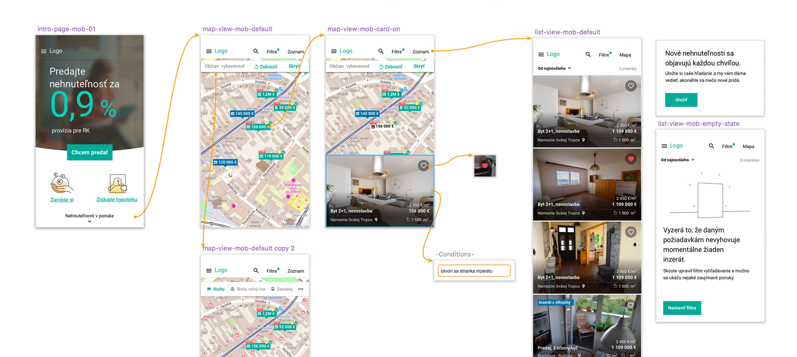
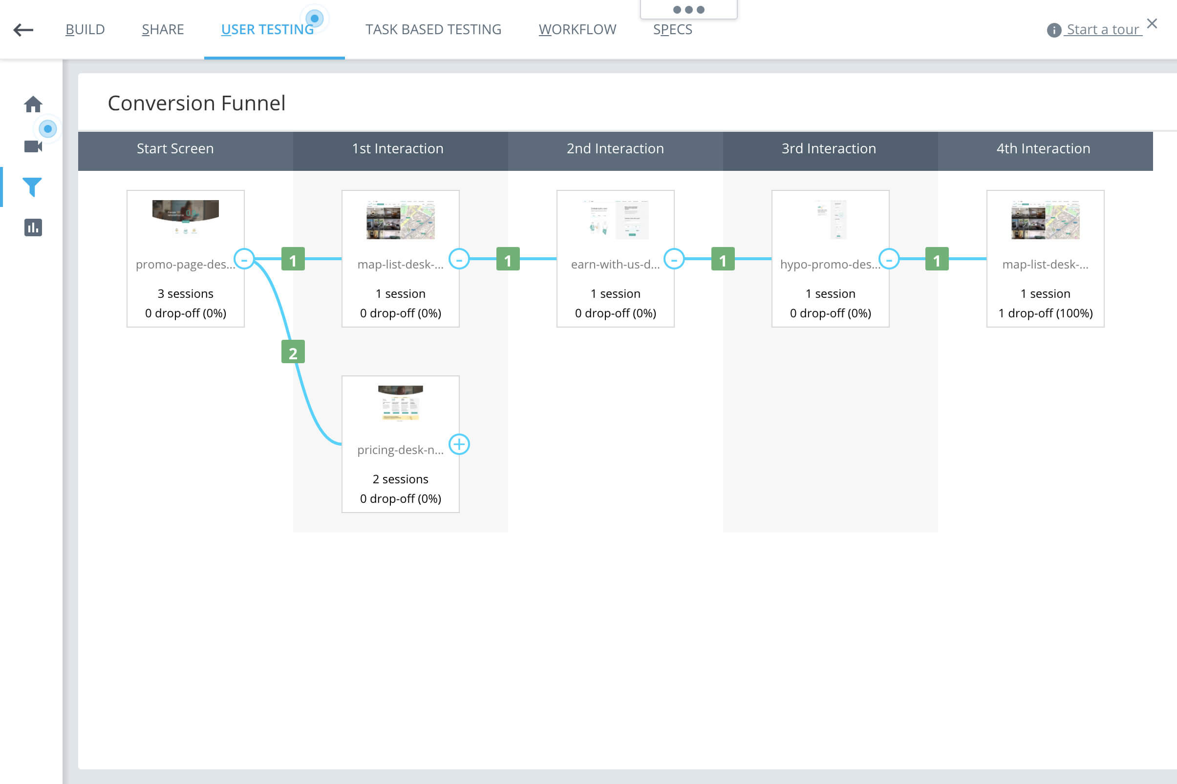
Clickable Hi-Fi prototypes of a feature flow we tested (mostly online) with 5 potential users - 1 represented early adopter, 1 was on the opposite side like late or "never" adopter. The online testing provided us also with quantitative data as average time spent, task completion rate, conversion funnels, and heatmaps.
Results of testing in CanvasFlip
(the app has been discontinued 😢)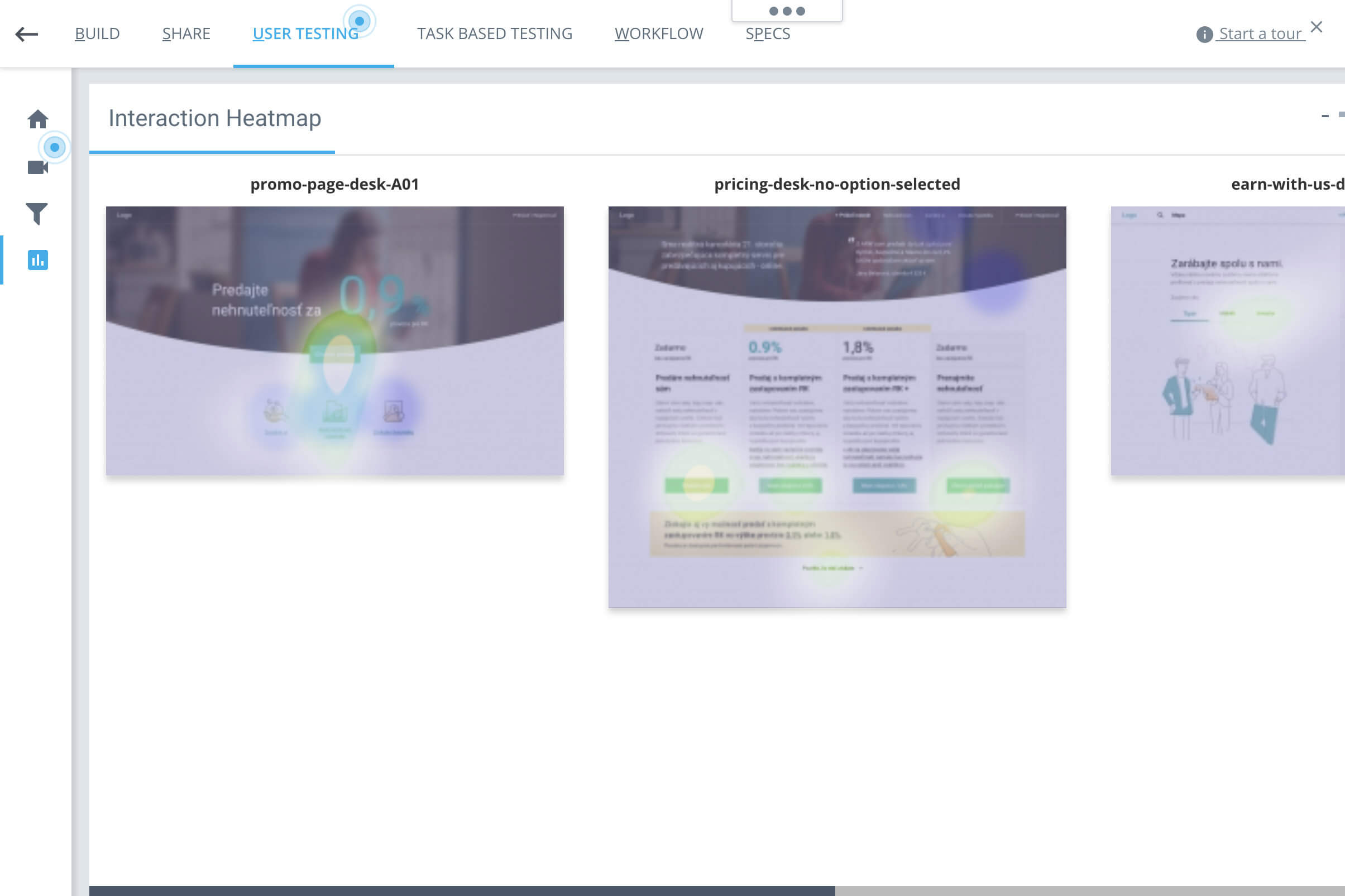
Design Hand-Over
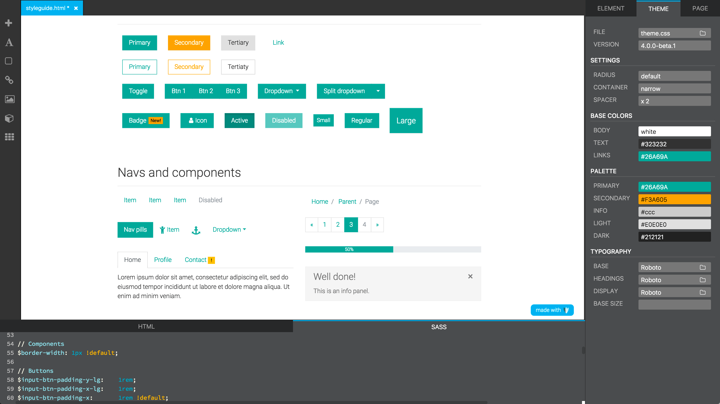
Transforming prototypes into components for production was fast and with no ping-ponging between designers and developers thanks to the Design System using Material Design library and my knowledge of HTML, CSS/SASS.
Examples of Design System

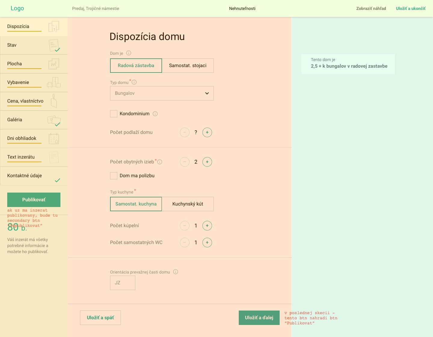
↑ Layout in CSS grid, sample in codepen
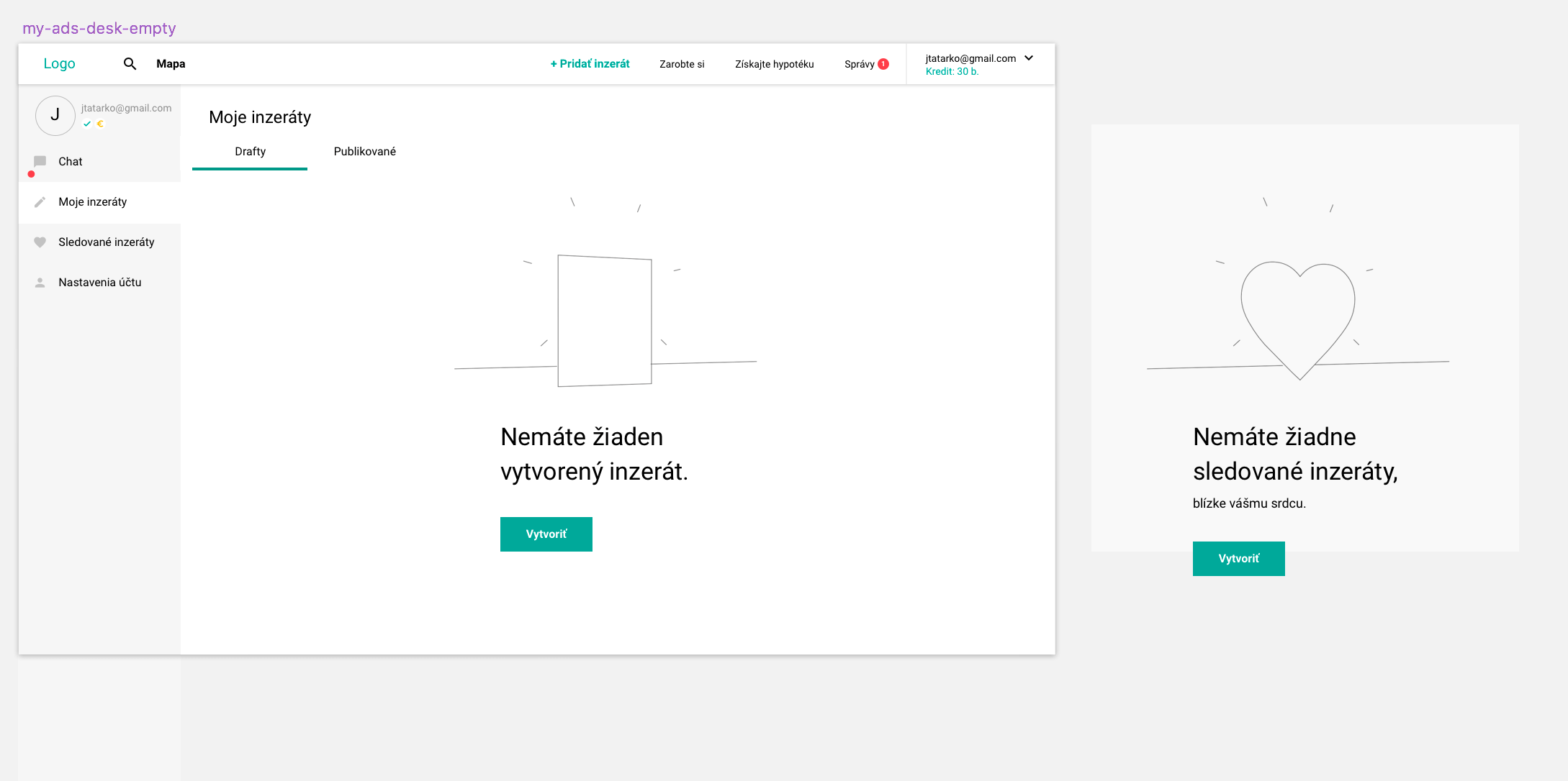
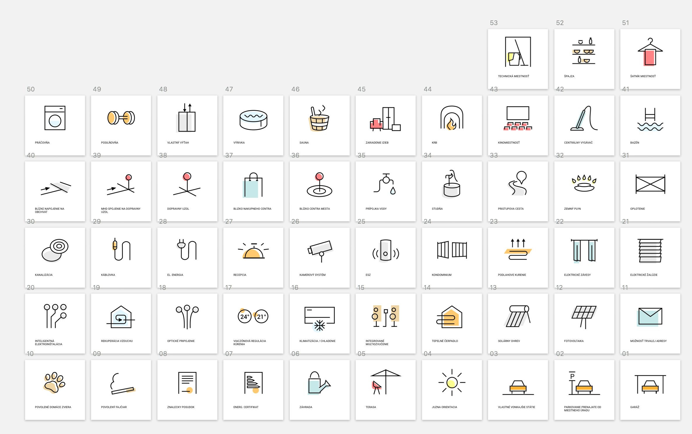
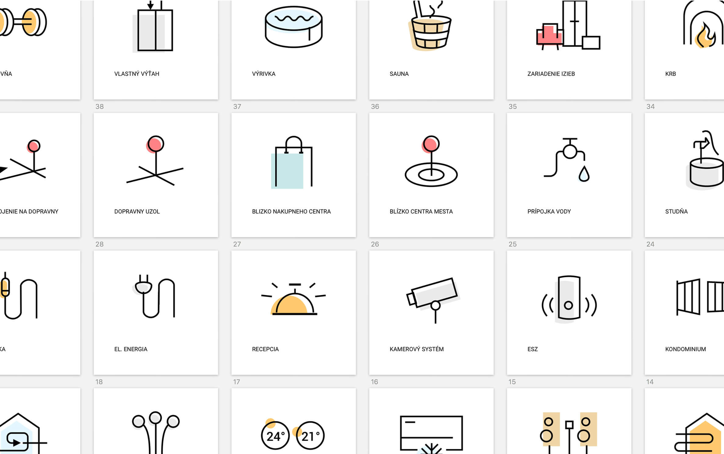
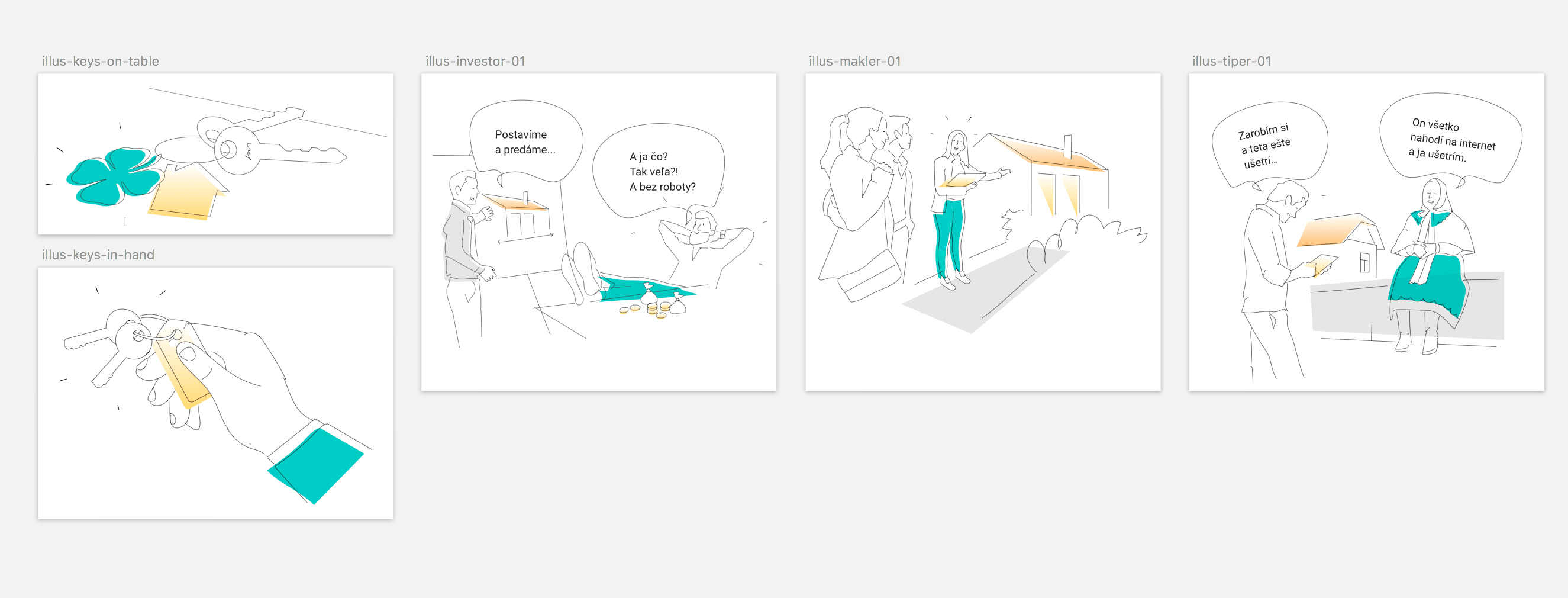
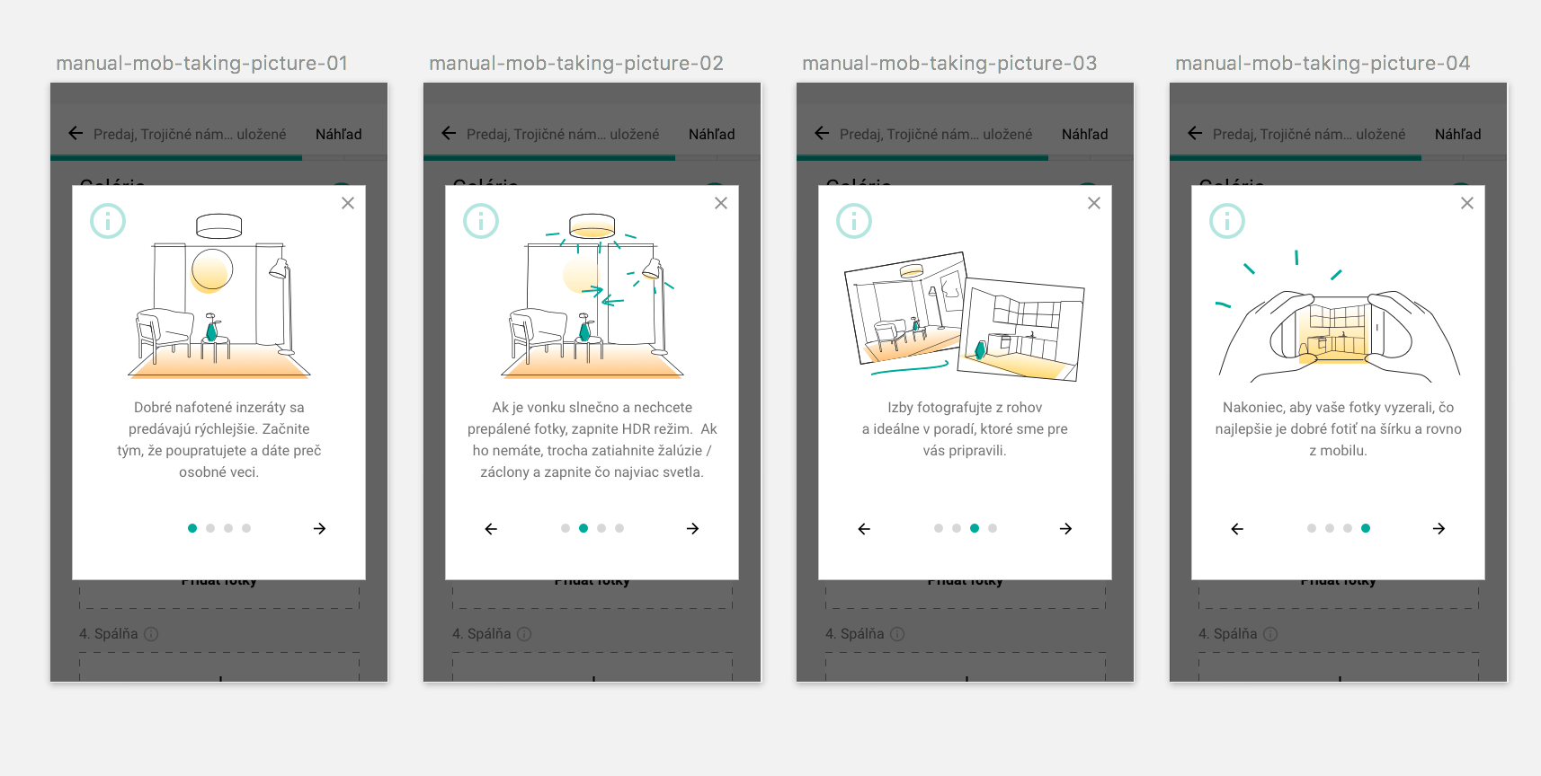
Custom Icons, Illustrations
Part of the project was to bring an element of desirability,
emotions to differentiate from the competition.
We decided to bring by
custom icons, illustrations, and creative copywriting.
“
Jakub keeps up with the validated UX/UI practices and using the
experience from marketing he is capable to bring aspects
of business viability.
An advantage is his understanding of frontend technology. So, as
a front-end developer, I have appreciated getting also feasible
outcomes 👍.

Michal Gasparik
Frontend Engineer
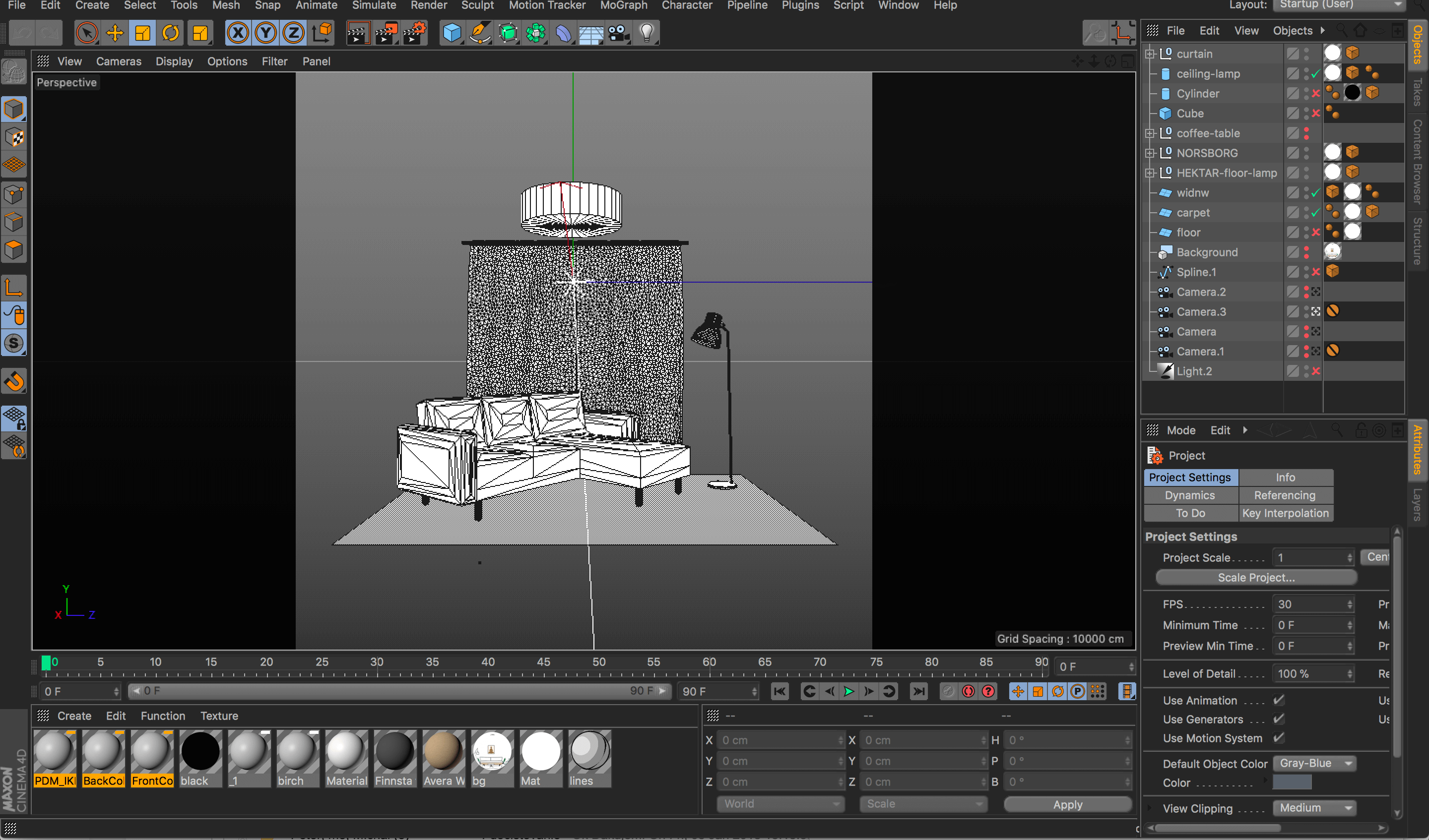
I created illustrations in 3D, those were exported into .svg
MVP
USP
Design Sprints