UX/UI Diagnostic for Škoda Auto websites
UX/UI Diagnostic for Škoda Auto websites
A client needed to get further buy-in for the stakeholder to
greenlight and finance
improvements on Škoda Auto CZ/SK websites.
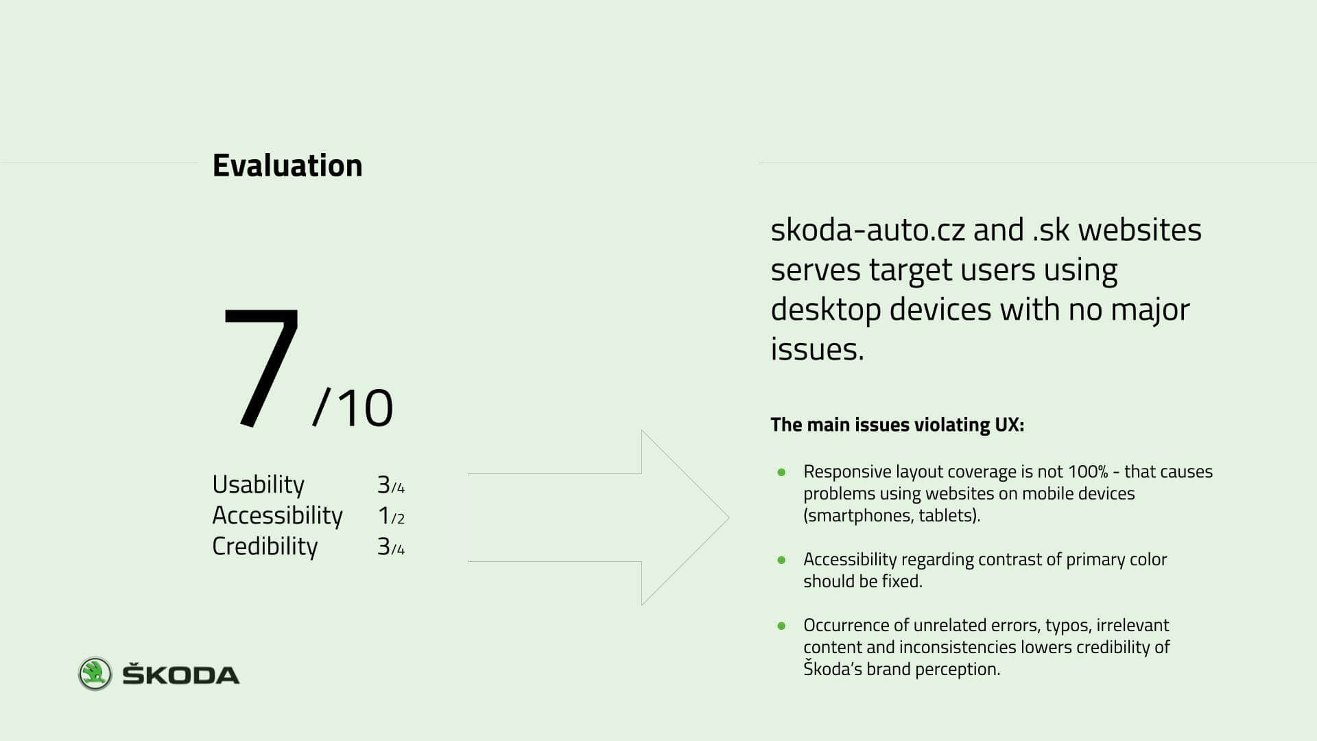
So I audited the user experience (UX) of the websites,
to discover the problems, prioritize them,
and
suggest
possible solutions.
Process
The process started by gathering quantitative data from
analytics and qualitative from customer support. With the
client, we defined 5 representants of customers and their use
case scenarios. Then we ran user tests.
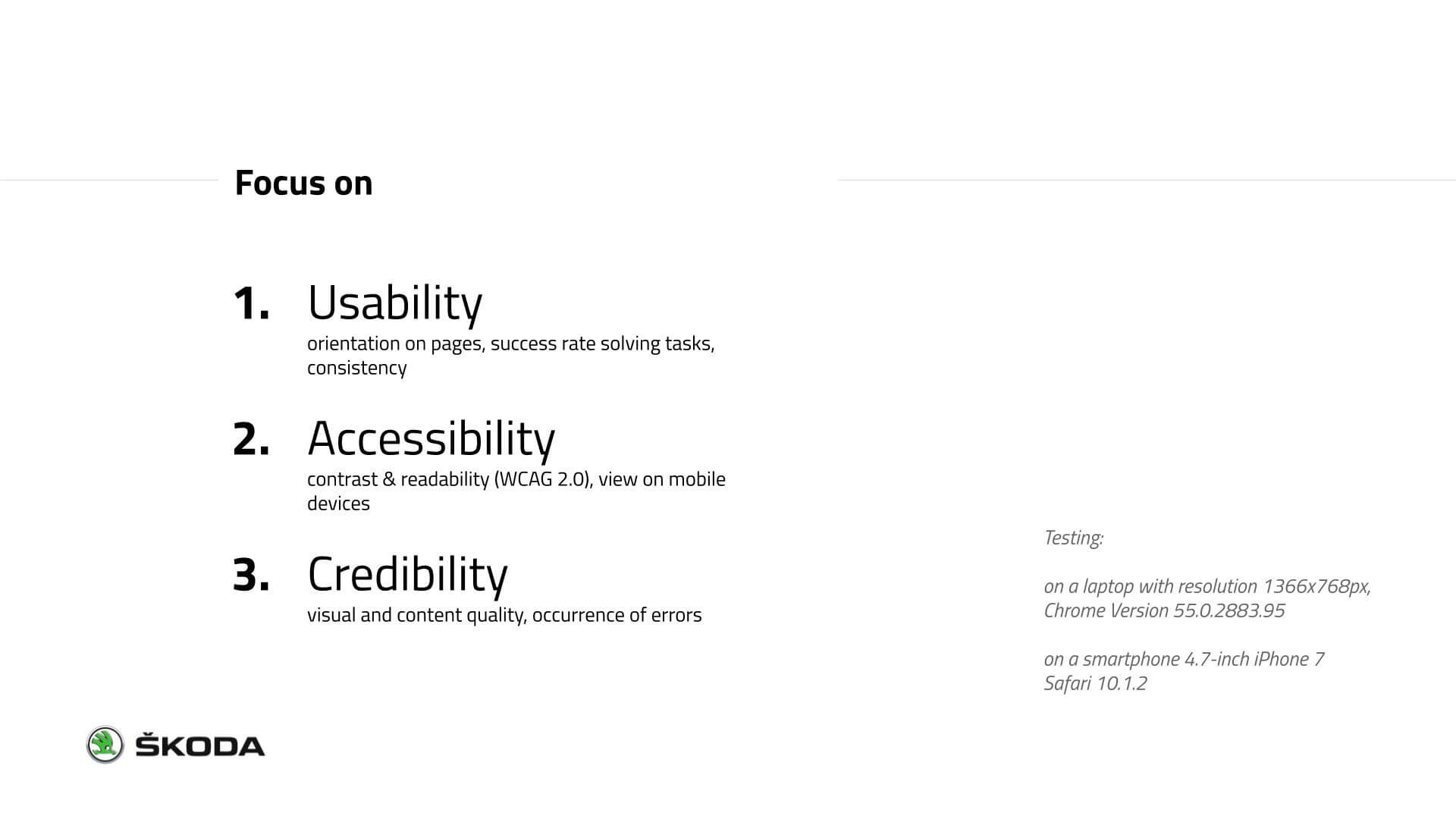
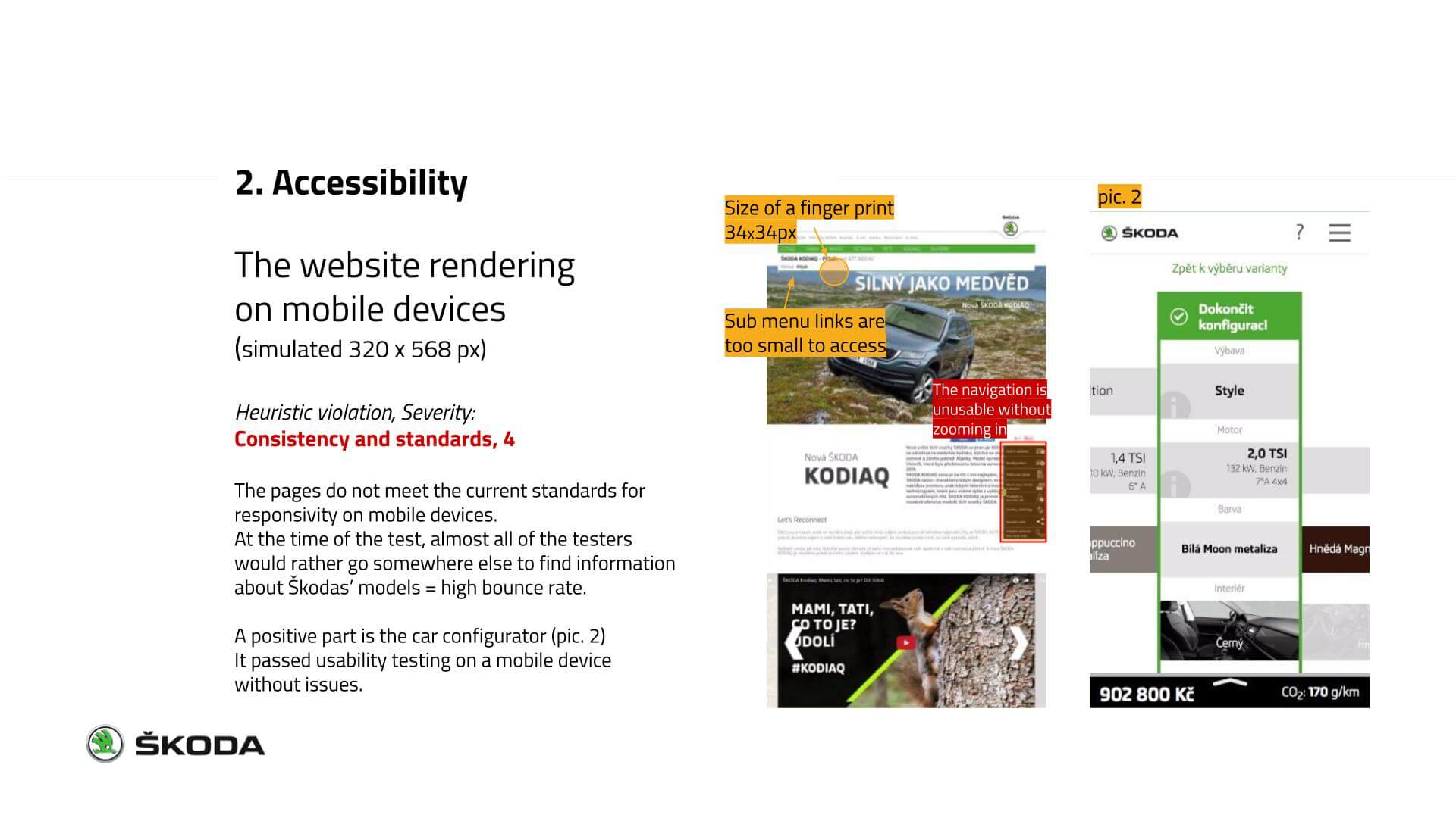
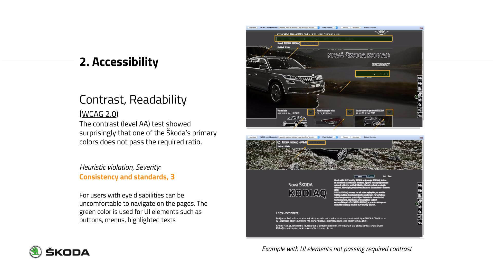
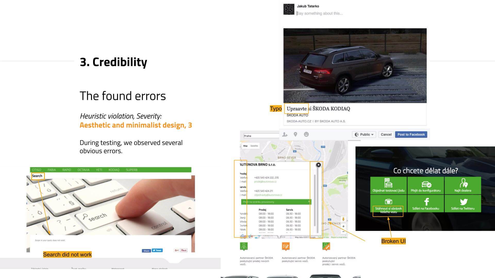
Analyzing the results, we focused on aspects of usability,
accessibility, and credibility.
Jakob Nielsen's Heuristic Evaluation
and Value/Effort Matrix
allowed us to prioritize problems and to decide where it's worth
investing in enhancing the user experience and reducing the bounce
rate - as we discovered this as one of the major problems.
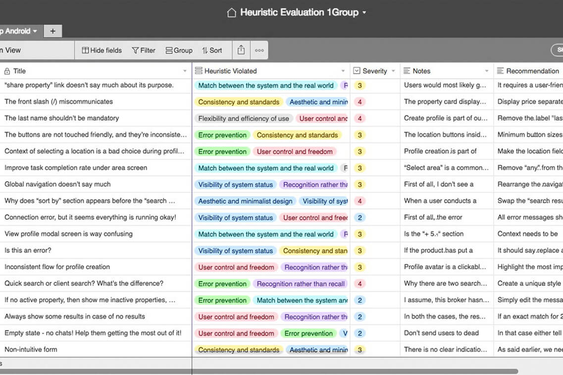
Example of Heuristic Evaluation Summary
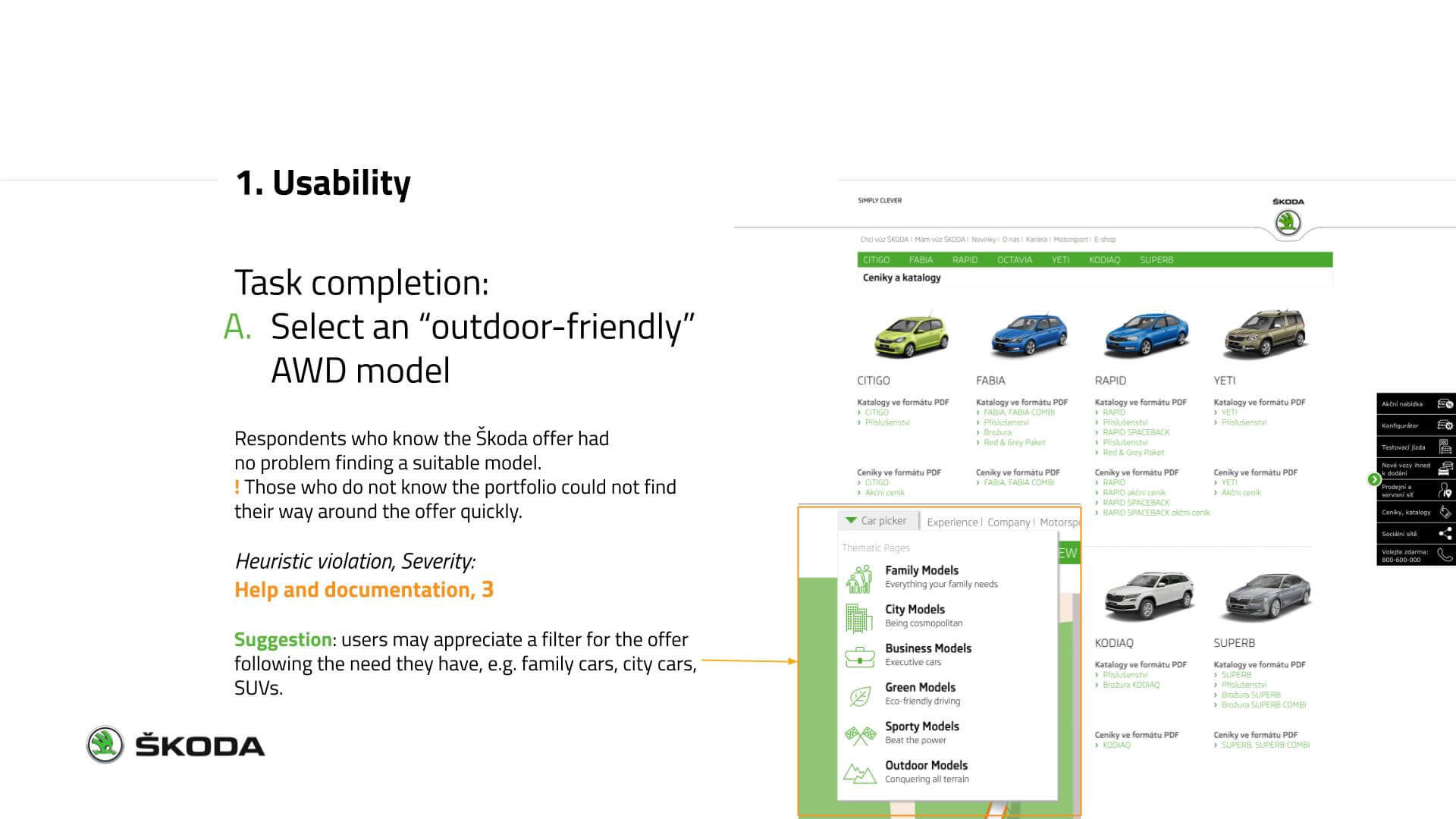
Parts from a presentation of results
“
Watch 👀 what users do, not just what they say.
Achievements
👉The UX/UI Diagnostic of Škoda Auto CZ/SK allowed to identify and prioritize areas for improvements on its websites where to invest.
👉Detected problems & implementation of suggested improvements e.g. enhanced comfort of use brought a significant increase in website traffic/sessions on mobile devices.
