4:0 for Innovating Sponsorship Management
4 months to turn an idea into a working product and secure Series A funding in the process?
Game is on.

sponsor.online set out to revolutionize how football clubs and brands negotiate sponsorships: Fair, Easy, Transparent.
The challenge? Build an MVP (Minimum Viable Product) that proves its value by generating first revenue.
With my expertise in bridging design and development, I was chosen to lead the product design where speed and collaboration would make the difference.
Discovery
Initially, stakeholders provided prototypes created to secure initial investment. Their vision seemed desirable and viable.
However, as I zoomed in and analyzed the designs, I spotted gaps in user flows and UX violations.
Yes, clubs would be able to create packages of items in their inventories. But how do they get the items into the inventories in the first place? Yes, clubs and brands would be able to negotiate deals together in a centralized and transparent way. But are we missing some critical parts in their workflows that we’re not aware of?
I presented this concern to stakeholders, and we agreed on a plan to define our MVP based on validated pain points from target users.
We reached out to sponsor.online’s audience—football clubs, rights-holders, brands, and their agencies. That was an exciting moment. Even as a not-very-avid football fan, I was absorbed by communicating with clubs like Paris Saint-Germain, Bayern München, Inter Milano, etc.
Through running in-depth task analysis with sponsorship and brand managers, we uncovered their mental models and the most business-critical bottlenecks.
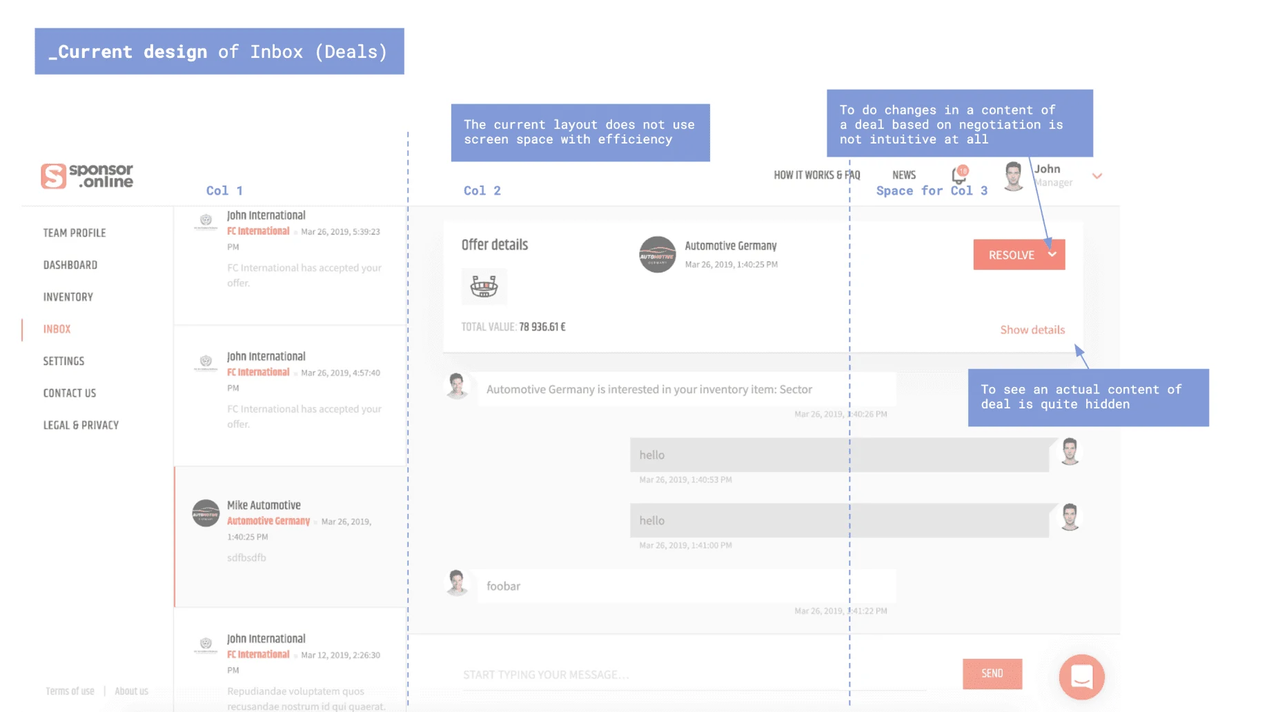
I used Job-To-Be-Done (JTBD), Value vs. Effort Matrix, and KANO model analysis to prioritize two core themes.
1. Data Onboarding Was a Multi-Week Nightmare
Clubs managed sponsorship assets across fragmented system: Excel from finance, Google Sheets from marketing, PDF reports from media agencies, CSVs from stadium management.
One Bundesliga club had data spread across 14 different files with 3-4 weeks of full-time work, minimum.
If onboarding took weeks, clubs would never commit. This was an existential threat to platform adoption.

2. Negotiations Were Fragmented Chaos
A brand sponsorship manager told us: “I’ve been negotiating with a Serie A club for 8 weeks. I have 47 emails across 3 threads, 6 versions of their proposal deck, and I still can’t tell you what the current offer actually is.”
Negotiations happened everywhere except in one place—email threads, PowerPoint decks, phone calls, separate contract discussions…
For users juggling multiple simultaneous negotiations, this meant lost context, off-the-record decisions, and vanished institutional knowledge when some people “left the conversation”.
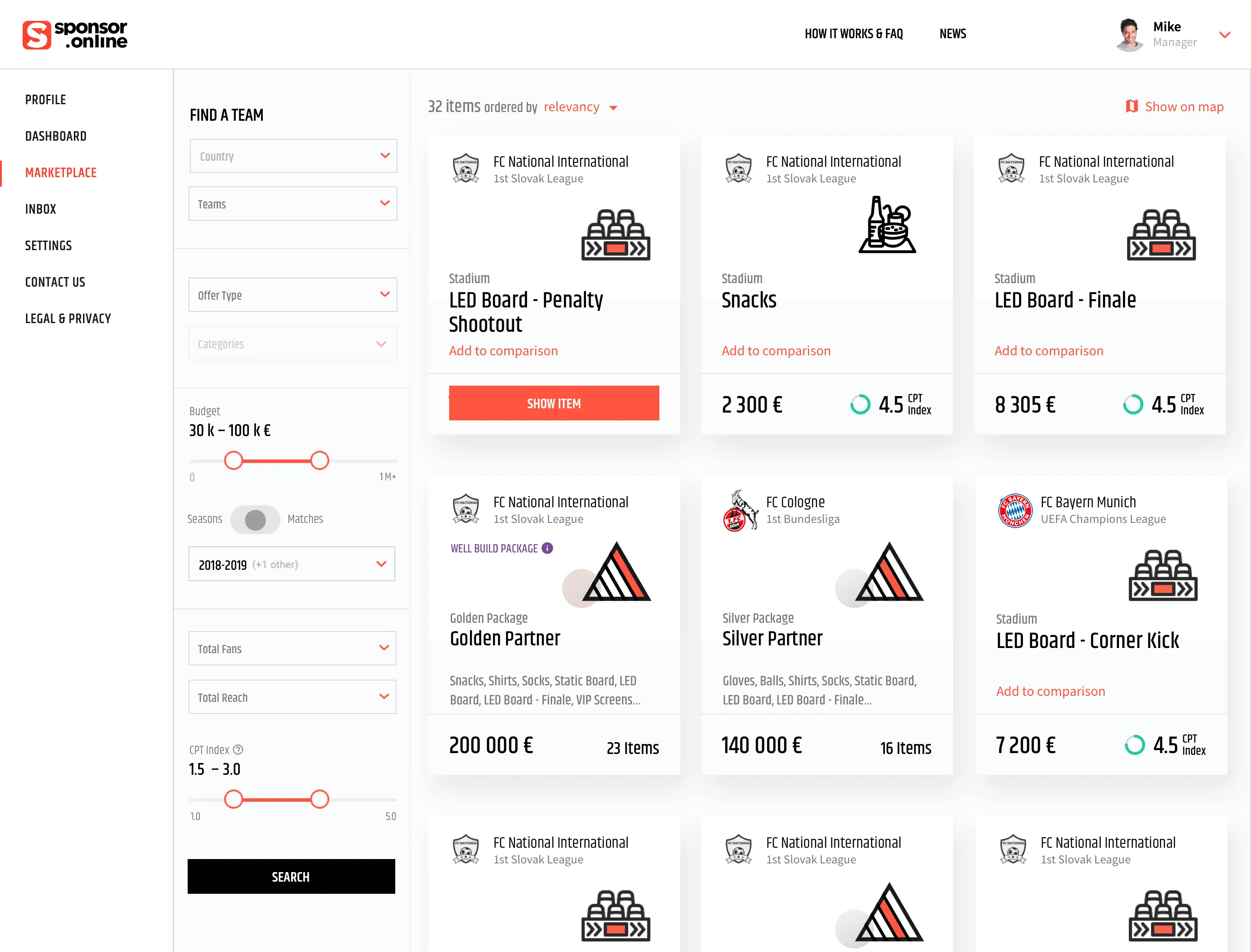
Brands also think in packages (“What can we get for €500K?”). For clubs, creation of custom packages often mean manual copy-pasting, pivot tables, calculating totals, and hoping for no errors. Then repeat for every revision.
It was time to address these opportunities.
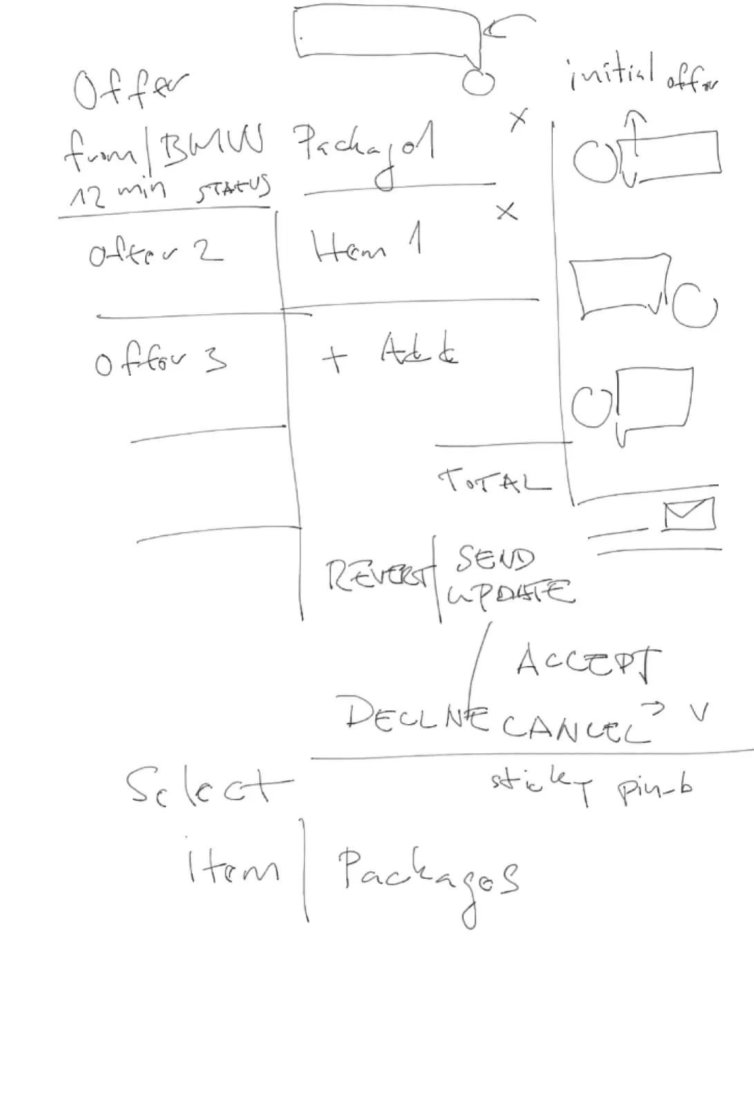
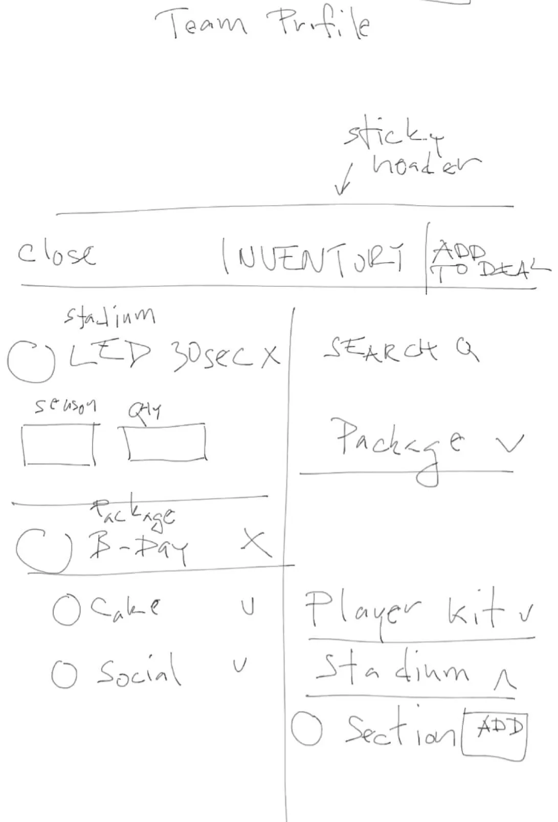
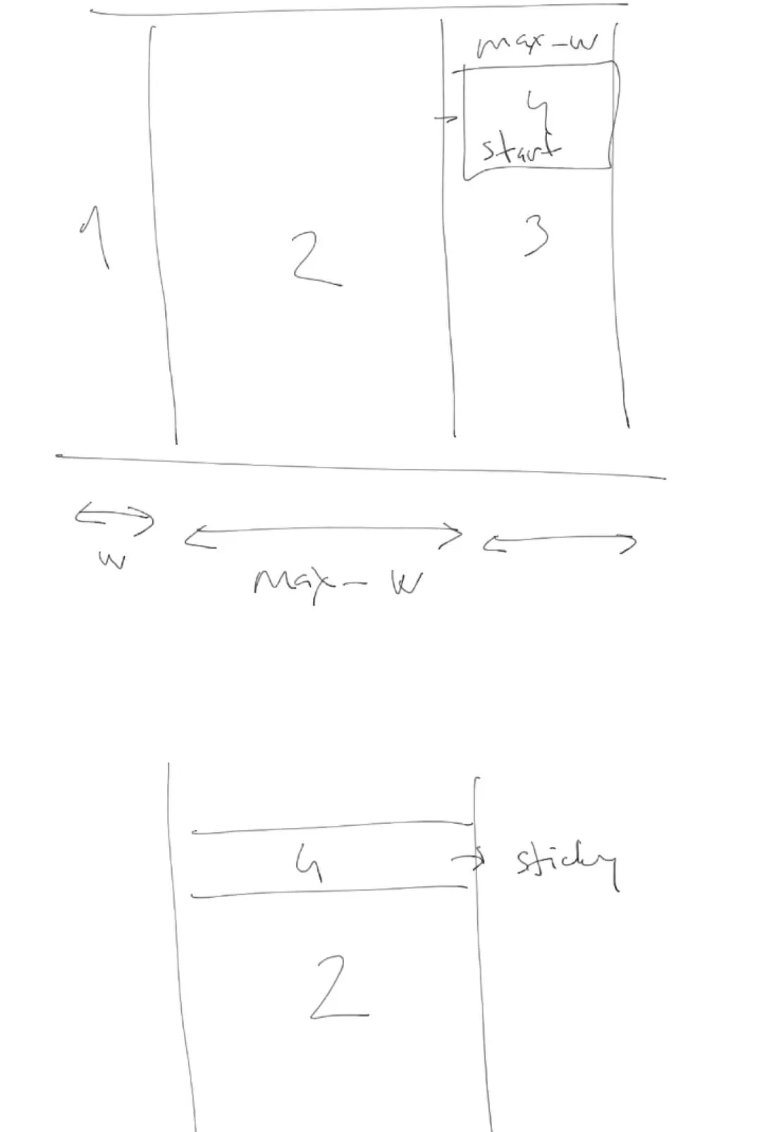
Lo-fi design sketches
Design
Smart Import & Data Harmonization
Situation
- Clubs wouldn’t standardize their systems for us.
- Data formats varied: .xlsx, .xlsm, PDFs, CSVs with different schemas.
- Field names weren’t consistent (“Sponsor” vs “Brand” vs “Partner”).
- Data was incomplete or contradictory across sources.
- 4-month timeline.
Based on that I have come up with:
Multi-Format Ingestion allowing users to drag-and-drop multiple file types into a unified interface. The system automatically detects structure, extracts tabular data, identifies likely field mappings, and flags ambiguous data for review.
Visual Data Harmonization Preview showing users how source data maps to sponsor.online’s schema with confidence indicators, highlighted conflicts or duplicates, and suggested merges where the same asset appears multiple times.
Bulk & Inline Edit to refine incorrectly imported data. Users can select multiple rows or cells to apply corrections and also create rules for future imports.
Watching a Bundesliga club representative drop 6 Excel files into the interface and see 80% of their data correctly mapped in seconds. They spent 15 minutes refining the remaining 20% instead of days copying cells. That’s when we knew we created value.
 Viktor Donner CPO at sponsor.online

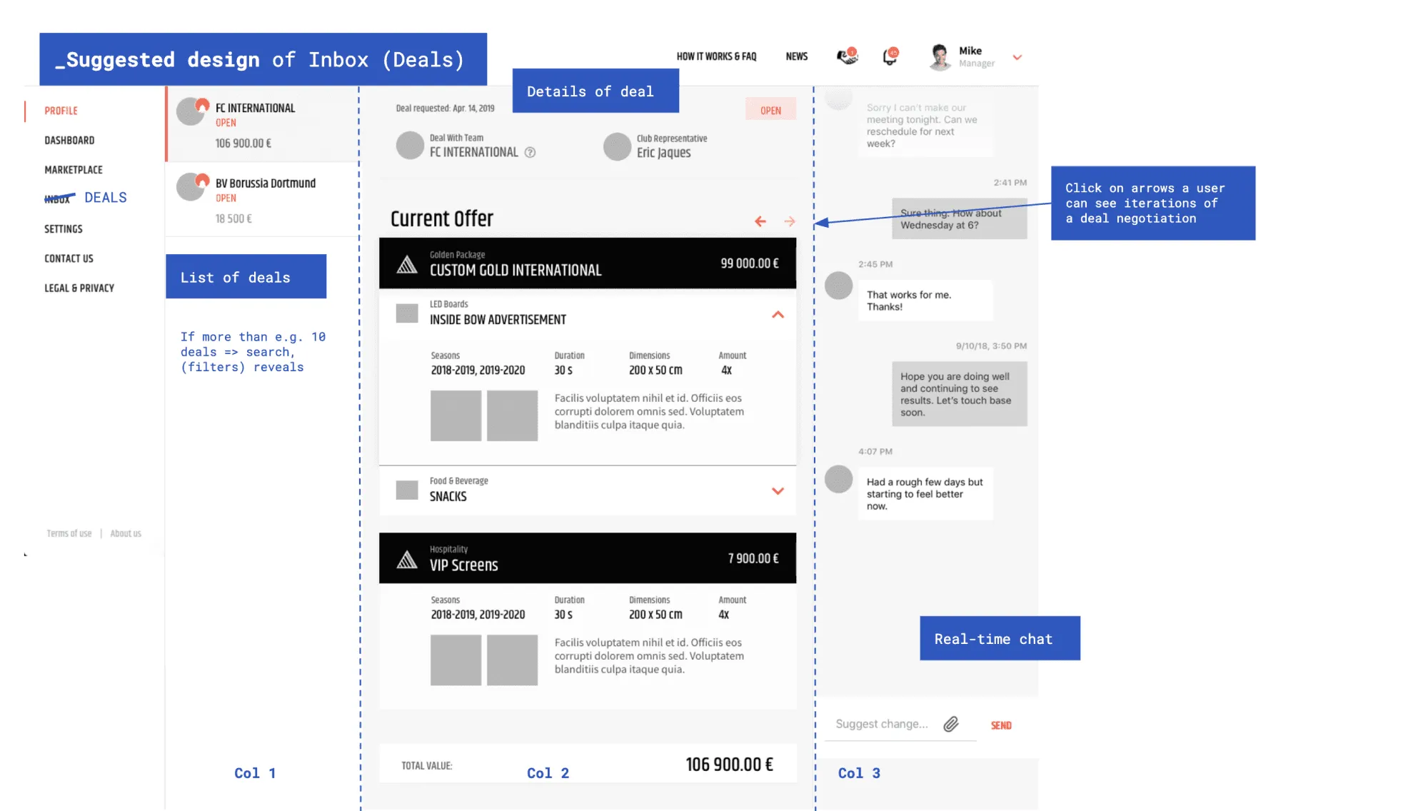
Unified Negotiation Workspace
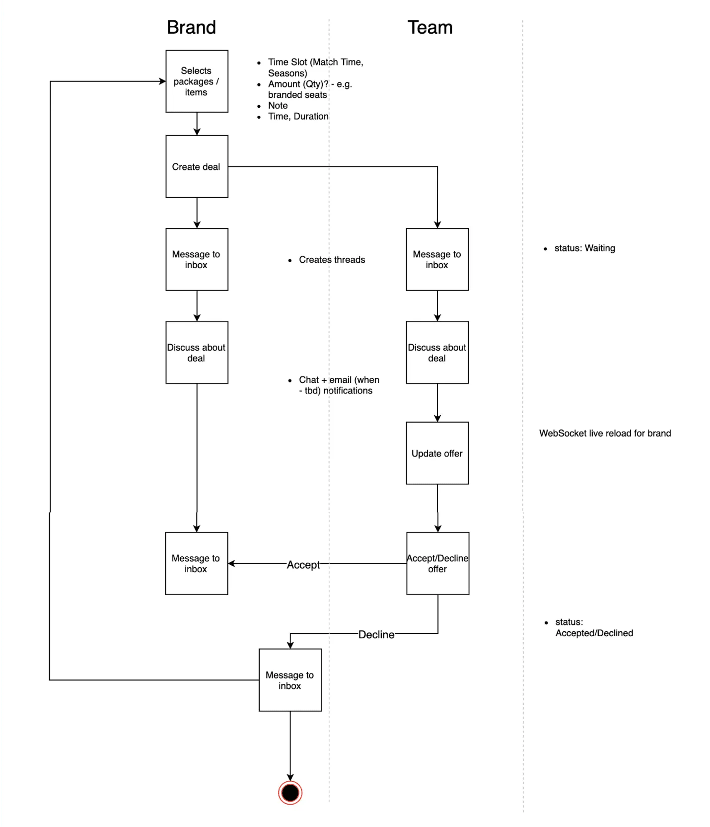
Beyond data import, we redesigned the negotiation workflow. Task analysis revealed that it would be naive to think all communication and negotiations would happen in sponsor.online.
What mattered to all user types was having the latest version of deals-in-progress available to all involved parties, with clear visibility into what changed from previous versions.
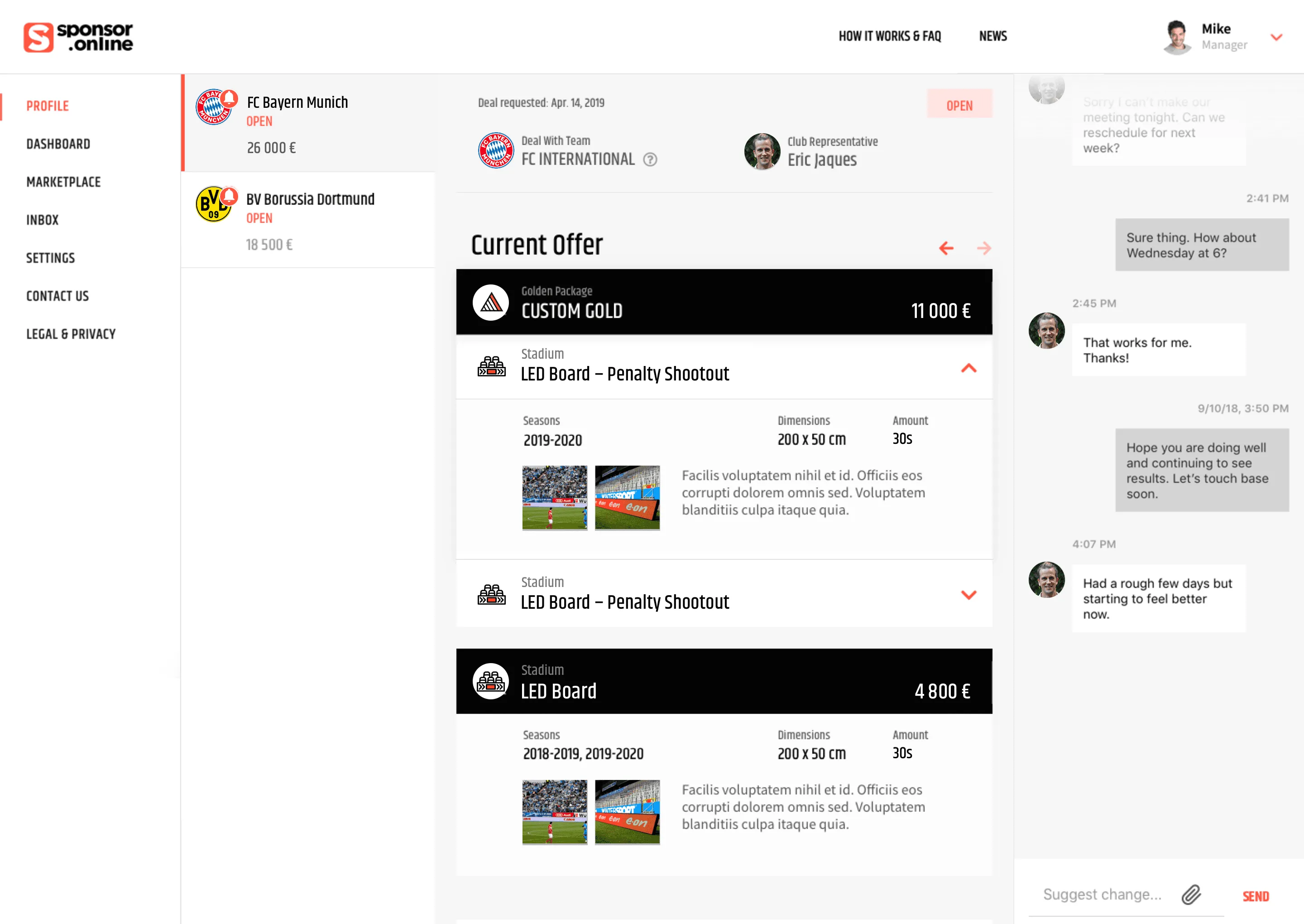
Inspired by how engineers use git to track and see changes in code, we transformed versioning chaos into a centralized hub with:
Package builders where clubs could create custom proposals from inventory in minutes instead of hours with PowerPoint + Excel.
Version control & change tracking showing all package iterations timestamped and preserved, with visual diffs highlighting what changed between versions.
Centralized negotiation log showing all interactions chronologically: package versions, messages, attachments, visible to all authorized parties.
Parallel Workflow
With validated problems and design concepts, we faced a new challenge: How could we deliver in 4 months?
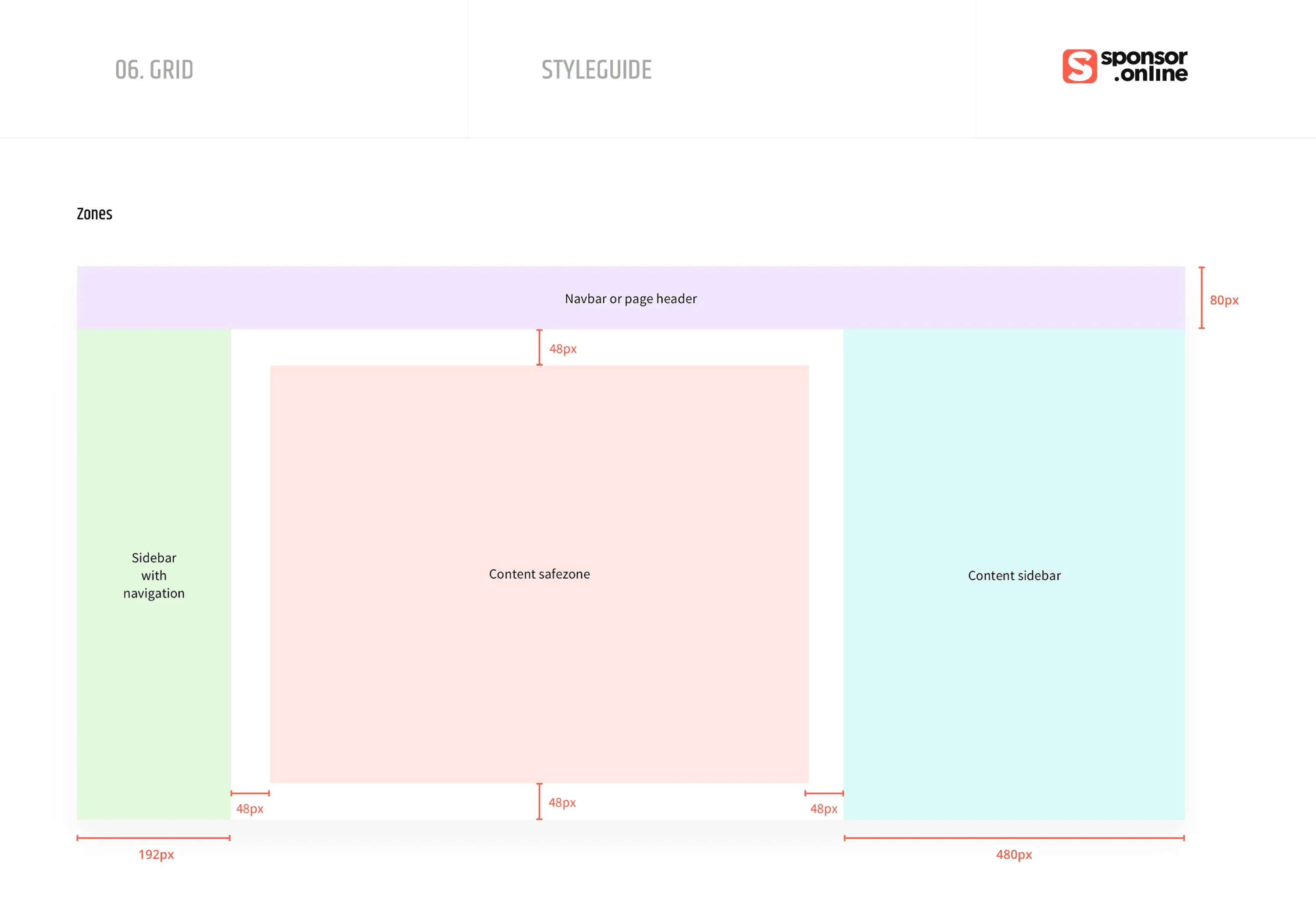
We debated two approaches. Traditional waterfall: Designers create high-fidelity designs, then developers code—risking bottlenecks and misalignment. Parallel workflow: Designers and developers workshop together in low-fidelity, identify all necessary components early, then build simultaneously—developers create component structure while designers style in Tailwind CSS.
Our bold CTO chose the parallel approach. Instead of perfecting static Figma designs, we built directly in code. This benefited stakeholders too—during investor checkpoints, we demonstrated fully functional features instead of clickable prototypes.
Although I had coding experience, sponsor.online’s UI complexity was new territory. After some nervous first commits, I dove into Tailwind and contributed to fast-paced development of layouts directly in the product.
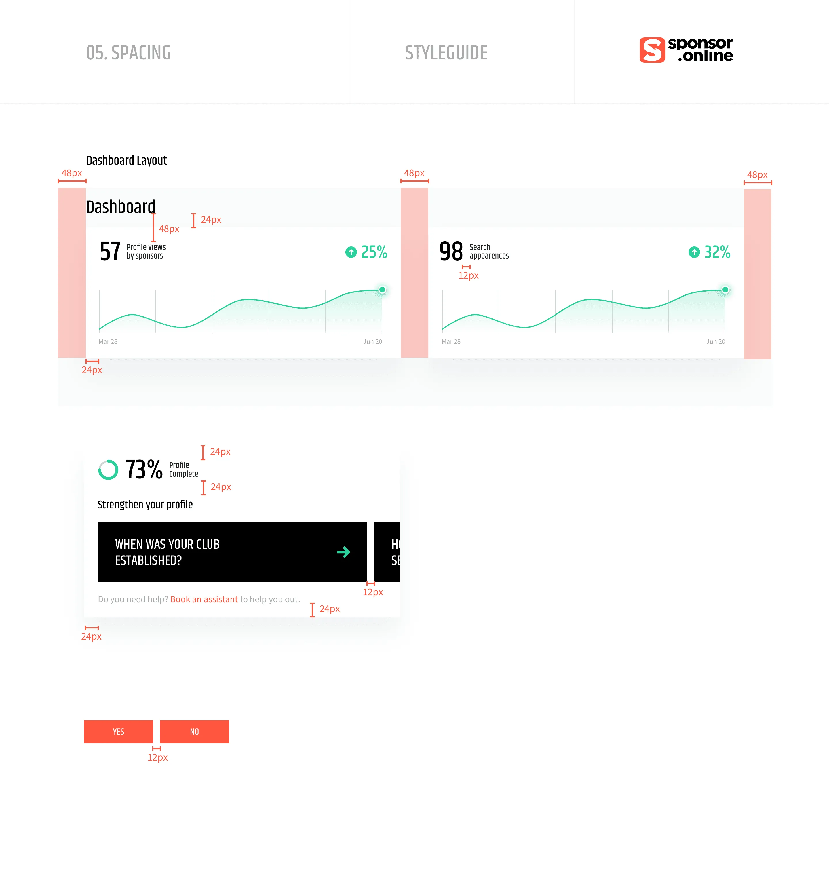
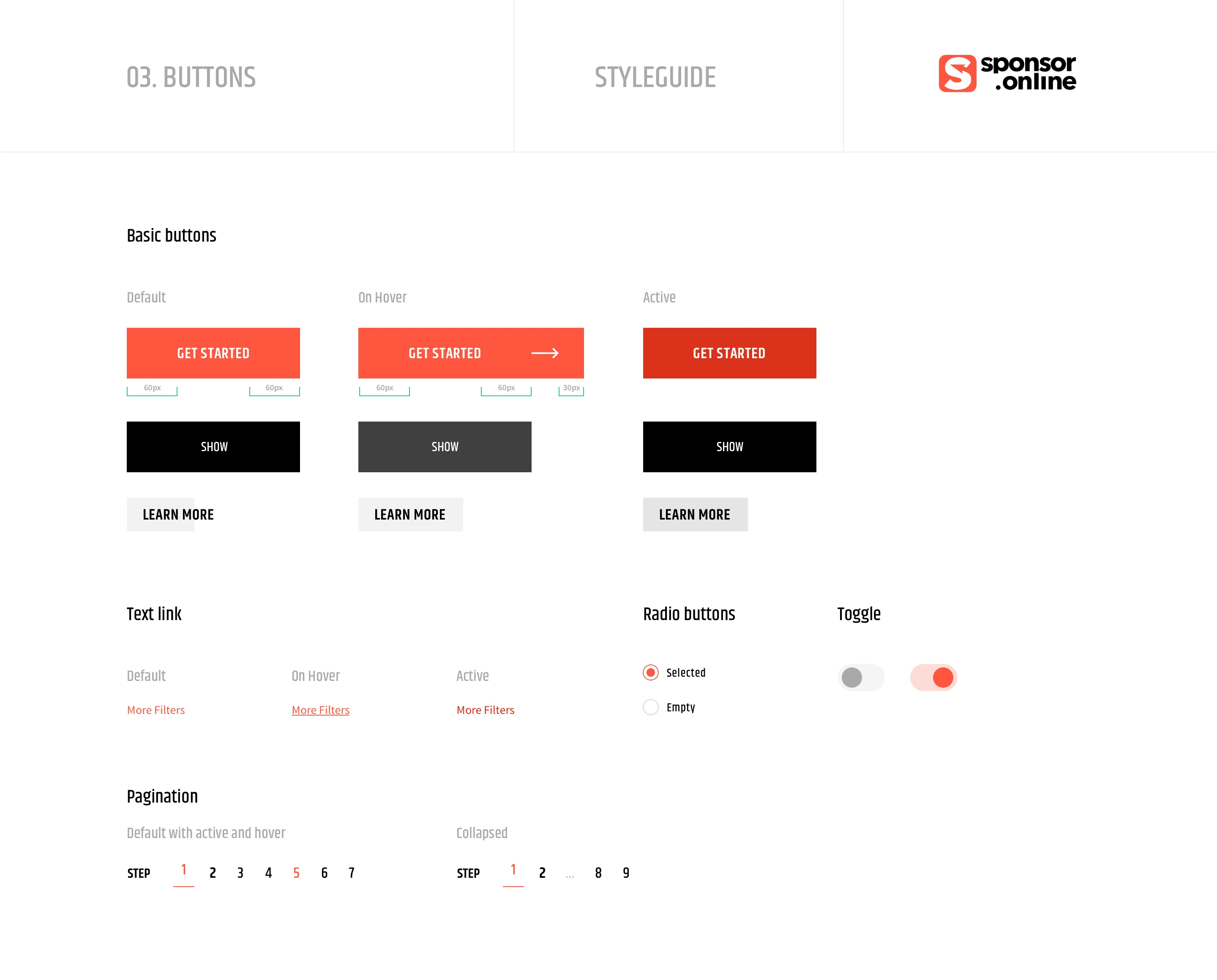
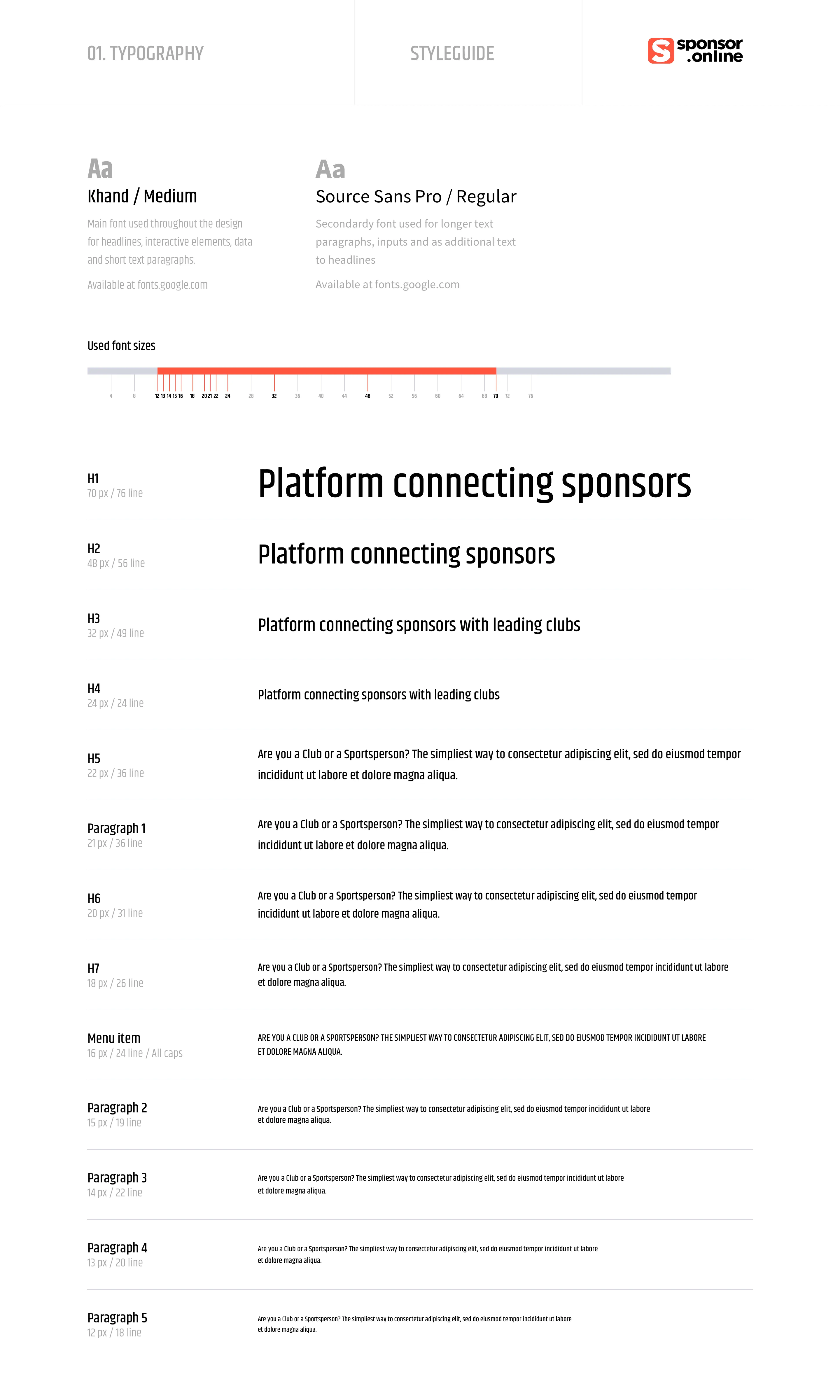
Jakub’s skills reach beyond what I expected from a Product Designer. Besides defining MVP, he was a big help in defining and building UI components using Tailwind CSS + React.js to speed up development.
 Rudolf Halas CTO at sponsor.online
Mobile-ready app
Outcomes & learnings
Invested in research
Two weeks with clubs and brands uncovered that solving data import and negotiation chaos became our core differentiators. Without this discovery, we might have built what the original investor deck and missed the opportunities.
Validated market fit
What used to be juggling with emails, spreadsheets, phone calls was now happening in a centralized, transparent place. Within 6 months of launch, sponsor.online secured Series A funding, with MVP serving as proof that the market was ready for this solution.
Parallel design & dev
We shipped the MVP in 4 months. That was critical in competitive fundraising. During check-points, design-in-code allowed investors to interact with real, functional features instead of “static images” wired together.