Frog's leap towards efficiency
They said: “Design system is causing delays in roadmap, wasted resources, and frustrated designers & engineers.”
I said: “Challenge accepted.”

Expectations
My experience working closely with engineers, with their language, and code was recognized when Adverity’s Frontend Architecture Board (FAB) approached me to lead the adoption of the Adverity Design System (ADS).
To kick things off, all relevant stakeholders were gathered to understand their expectations, insights, and align on measurable goals as Objectives and Key Results (OKRs).
In the following quarter, we aimed to:
- Reduce DS-related blockers in code reviews by 50% from the current baseline tracked through GitHub and Jira.
- Increase external team contributions to the DS codebase by 50% from the current baseline tracked through GitHub and Jira.
- Have DS compliant with WCAG 2.1 AA.
Goals aligned, budget approved, we were ready to make it real.
As the solo designer joining a hybrid team of five engineers, the key to success laid in understanding the team dynamics and earning trust. I set up individual interviews with each team member to hear their experiences and learn about workflows, pain points, expectations… and stories.
These sessions created a shared language and common ground.
Voice of users
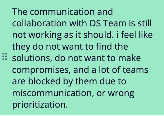
With team alignment in place, it was time to hear from our target users: internal developers and designers. While anecdotal insights existed, structured, unbiased data was missing.
Partnering with the UX Research team, we designed a survey focusing on qualitative and quantitative feedback, which achieved a 72% response rate (76 of 106 developers, designers, and product managers). The issues of the design system resonated across teams.
*This survey has run every quarter since and measures NPS + collects data for future opportunities.
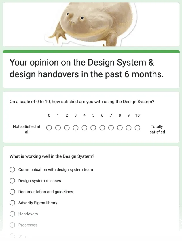
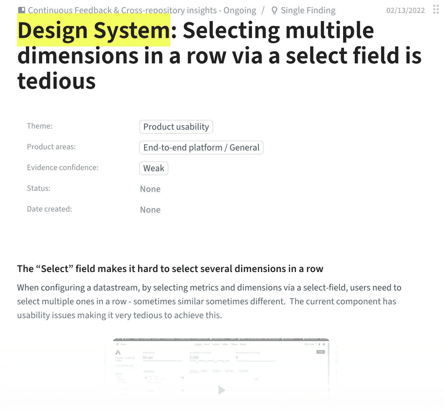
Plenty of data to analyze. Luckily, our AI friend ChatGPT handed us help to see themes in responses and created an affinity diagram. We plotted the themes into the impact vs. effort matrix to prioritize them. Based on the results, we selected designers and developers for in-depth interviews to deep dive into understanding the root causes behind the most painful issues.
Key findings stood out:
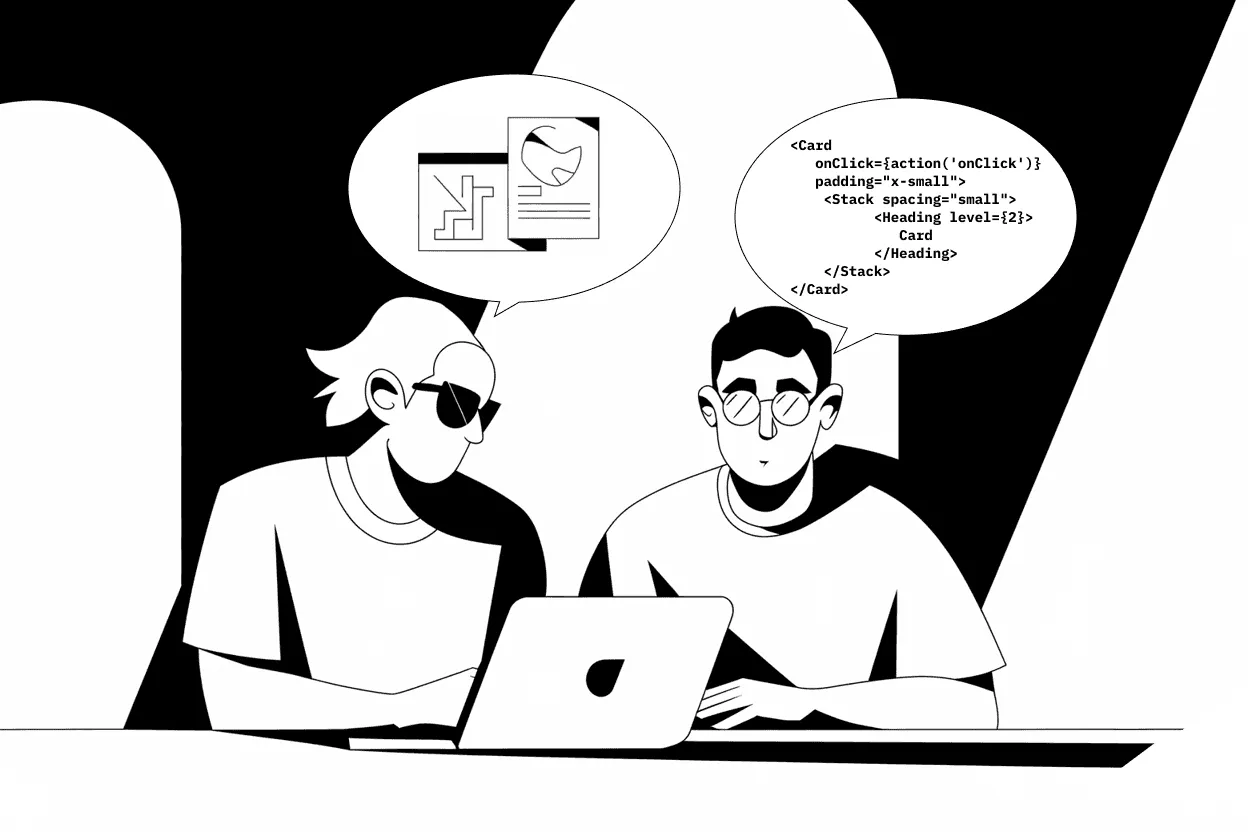
👉 Designers and developers were using different terminology for the same components, leading to miscommunication.
👉 Both groups struggled to find the components they needed.
👉 Designers found the documentation overly technical and hard to navigate.
👉 Designers were also missing DS components in the Figma library.
👉 Some developers were unnecessarily creating custom tokens and components instead of relying on the design system.
As a product
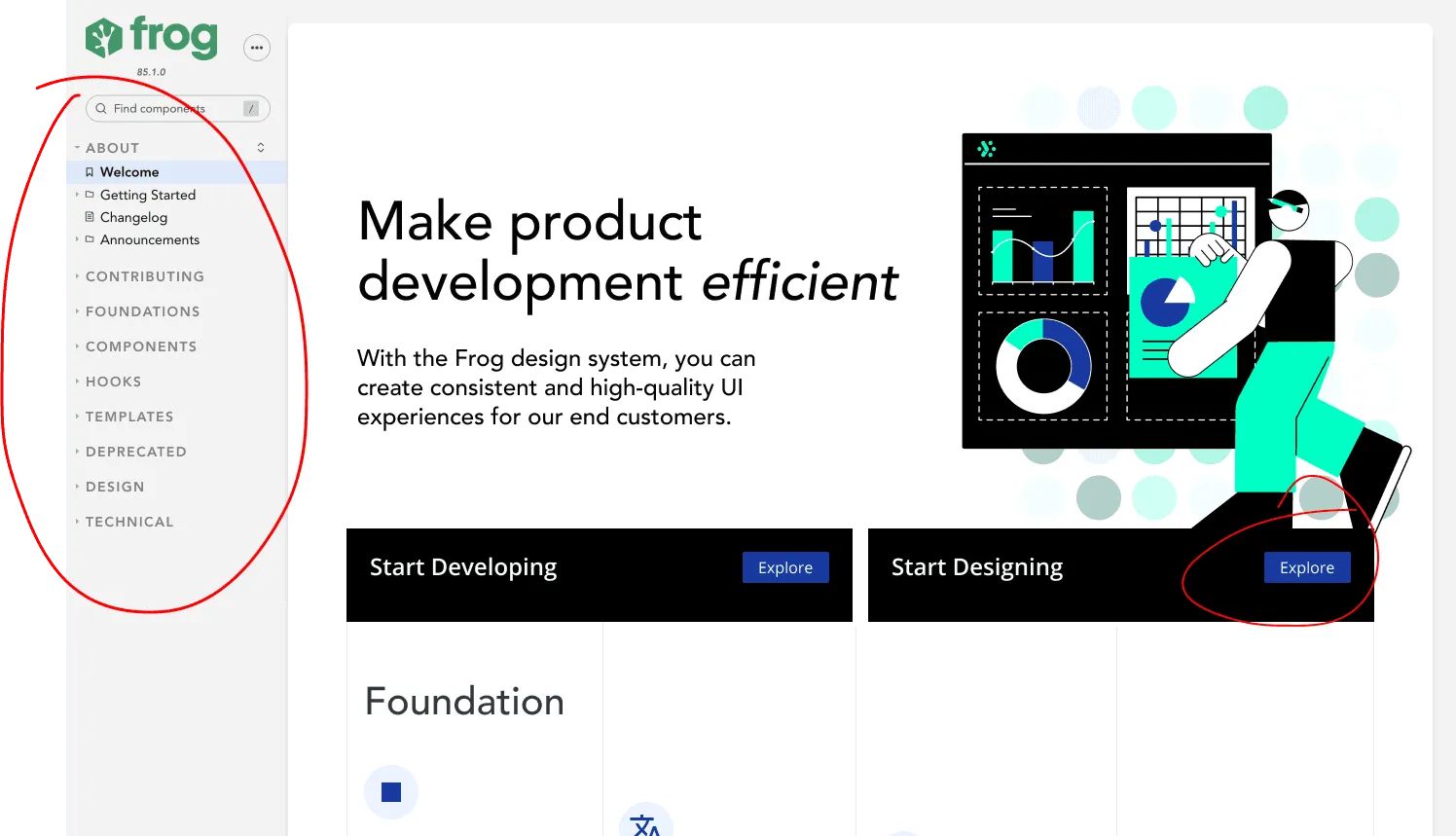
Armed with user insights, we realized that driving adoption required a fundamental shift in perspective. So the “Frog” was born, ready to leap from idea to implementation as we introduced a name and branding for the design system.
The Frog became something tangible, relatable, and fun. It opened up a world of possibilities: we could now tell stories around the DS, build engagement campaigns, and create resources that felt welcoming rather than instructional.
Documentation
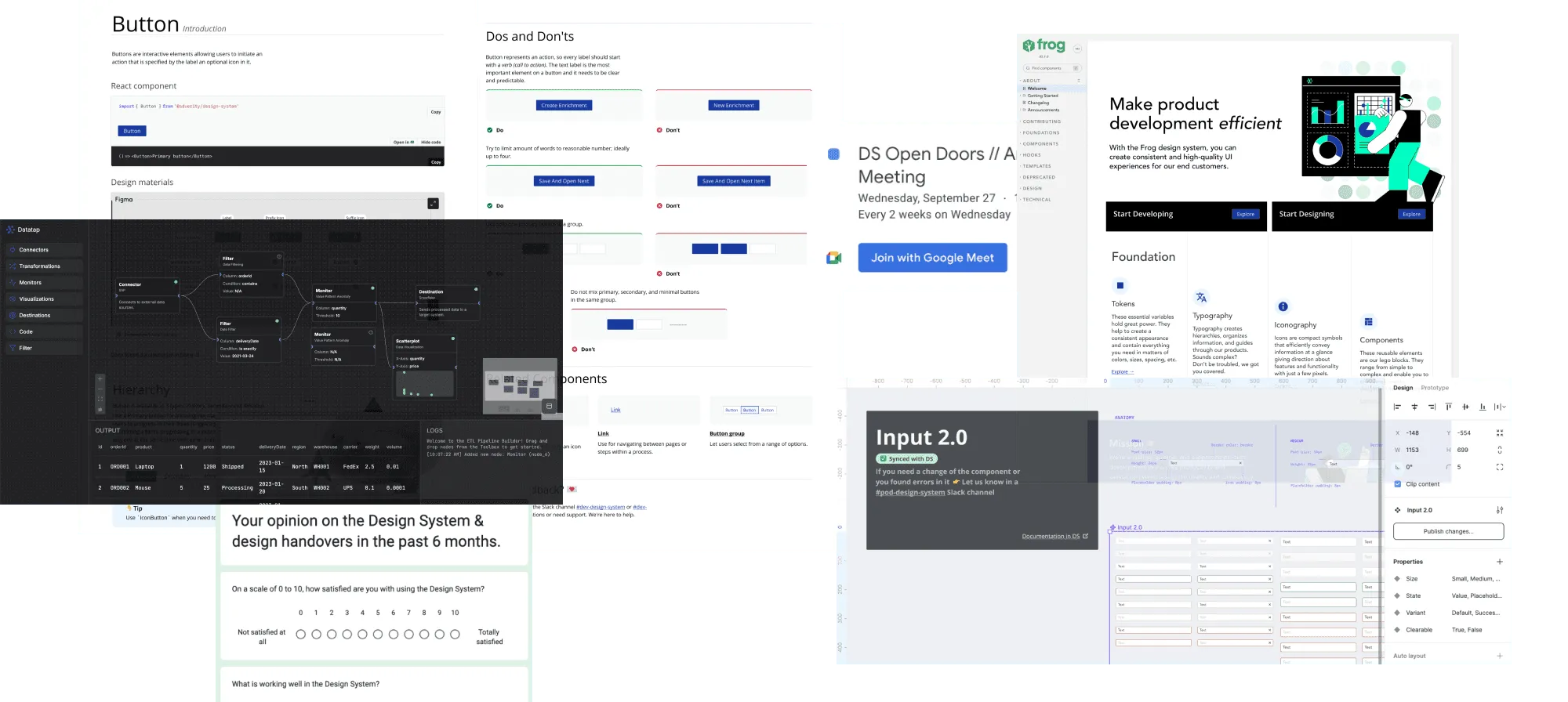
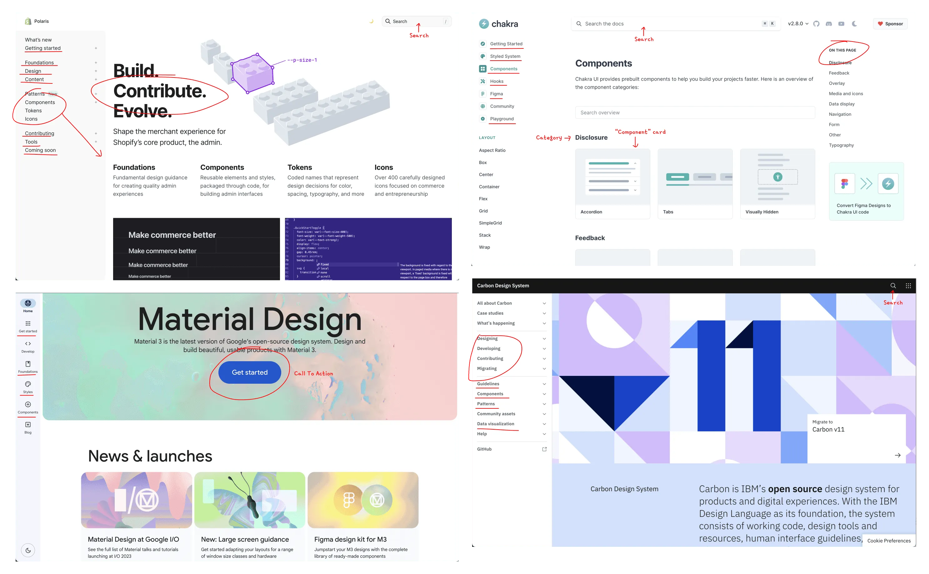
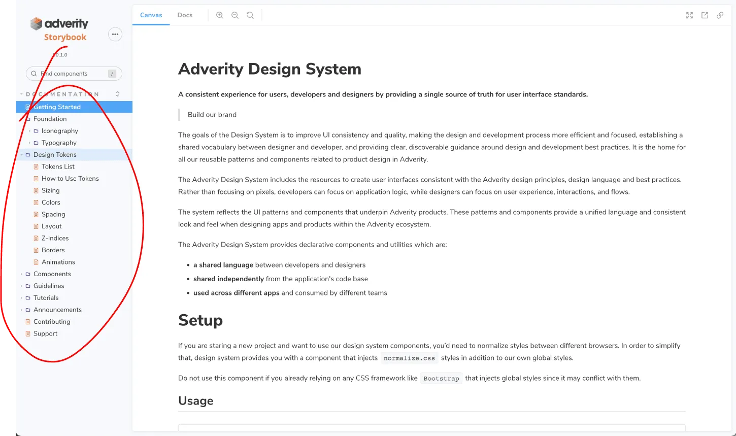
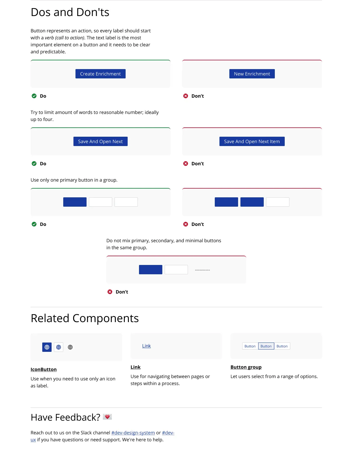
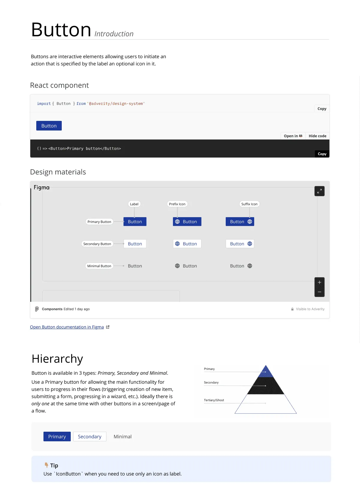
The documentation is the core of the design system, and research made it clear that the core needed an overhaul. Designers found it overly technical, and developers struggled to locate needed information.
To address this, we ran card-sorting workshops, improving information architecture, and then conducted opinion polls for component and token naming.
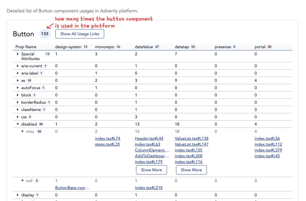
Developers created the Usage Collector: a tracking tool on how components were used across the product. It allowed us to identify underutilized and redundant components, simplifying the library.
This led to clearer navigation, more intuitive component names, and improved grouping logic. A new homepage, a template for component pages, and a dedicated section for Adverity’s design principles were created with helping designers to feel welcomed too.
Towards designers
At Adverity, the code repository was the single source of truth for design system components and tokens. Developers also had a sandbox environment (“Playground”) where they could prototype efficiently. Designers were facing a different reality. They relied on the Figma library, which often lacked components or was out of sync with the codebase.
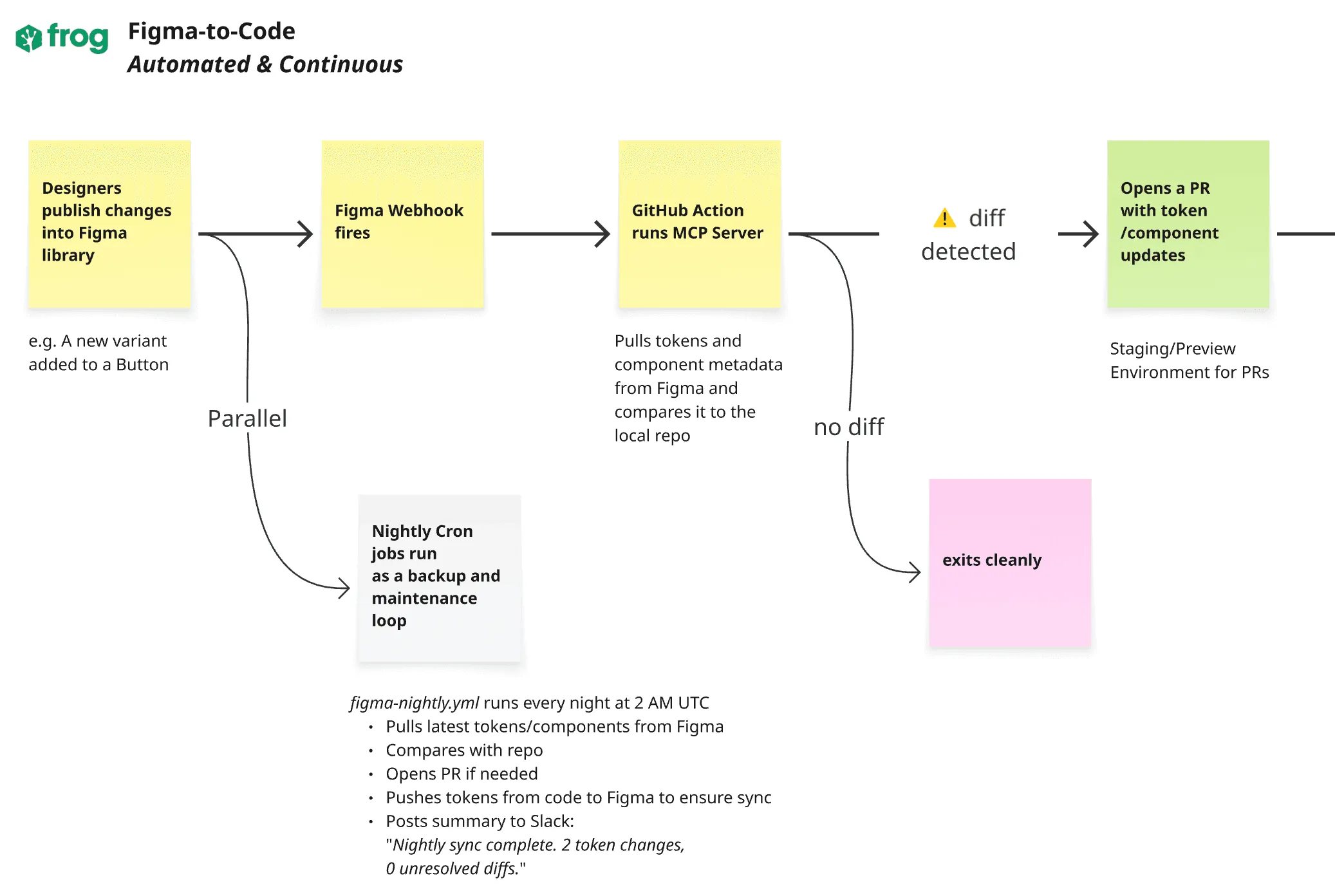
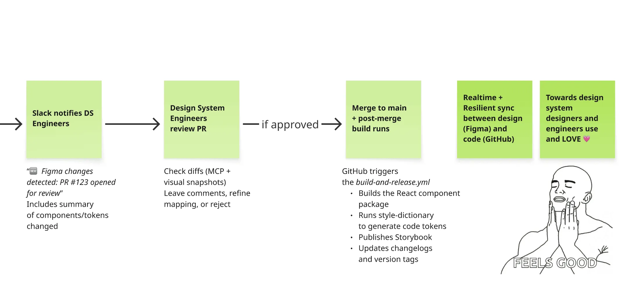
We started looking for a solution using the DS code in Figma. Straightforward idea: the components and tokens would be rendered into Figma and stay synced. I was sure solutions for this existed, or not?
Searching for Figma plugins, we realized that this use case of syncing and translating DS code into Figma components, at that time, was really a niche. The majority of plugins did the opposite.
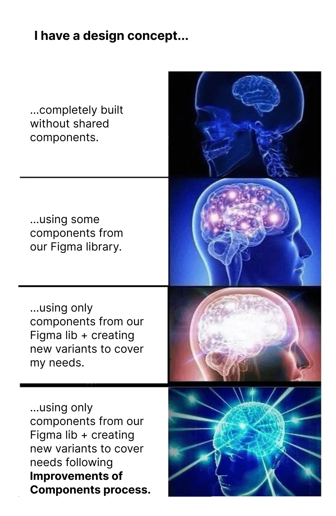

With lessons learned, and back to the drawing board, we decided to use what we had at our disposal. We analyzed how often new components were released and updated.
Good news here: not often. This allowed us to focus more on sync accuracy than speed.
An audit of Adverity’s Figma library followed. We discovered which components were missing, outdated, not compliant with a11y or disconnected from the actual codebase. With that data, we estimated the resources needed and got the green light from stakeholders… to begin engineering the automated sync between design and code.
Updated version for 2024
Missionaries
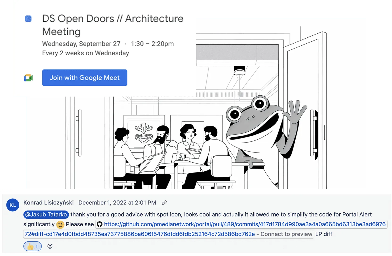
We understood that adoption wasn’t just about tools and documentation: it was about creating a space for dialogue, learning, and feedback.
So we opened our doors, literally, as we created a Design System Lab: a hub, both offline and online, where designers and developers could:
- Ask questions and seek guidance directly from the DS team.
- Share pain points and ideas in a safe, collaborative space.
- Work together openly, fostering an atmosphere of shared ownership.
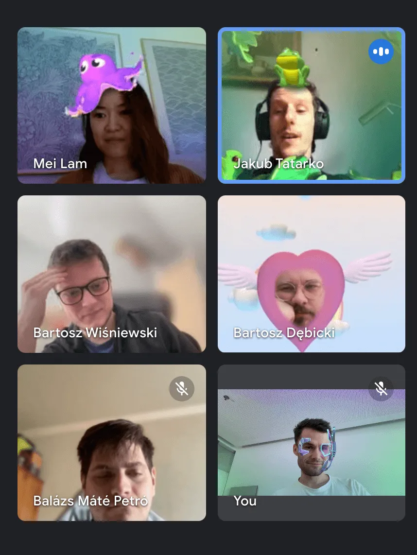
Regular internal (streamed online) meetups were hosted. And with every session, awareness about the design system grew, engagement increased, and the active user base expanded.
Gradually, the design system transformed from being perceived as a rigid set of rules into open and shared project.
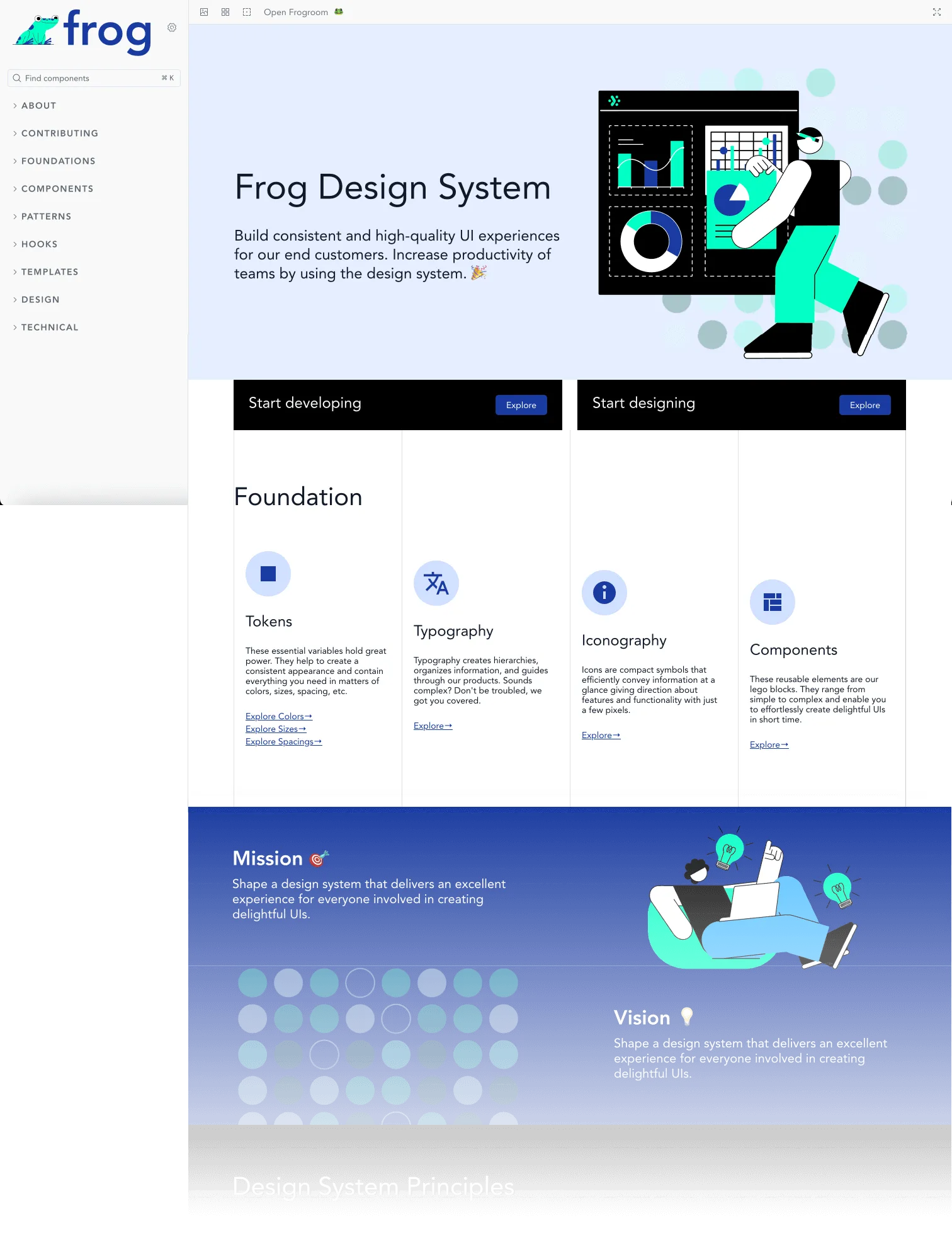
The Frog came alive...
… and my mission complete.
Design system was no longer a bottleneck. The Figma library stayed updated, the documentation became accessible, and contributions from designers and developers across the company common. The Frog had leapt to its initial goals and became a thriving part of Adverity’s design and development culture.
Thank you the Legendary team of Design System.
It was my honor to serve with you.
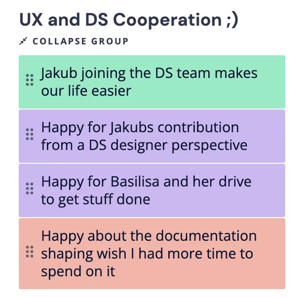
Long live the Frog! 🐸✨
Solved challenges
The results of this project present smoother processes, clearer communication, and faster outcomes across design and development teams. This is an example of measurable ROI from targeted improvements. It sets the stage for long-term adoption and success. Great job team.
 Rudolf Halas Adverity's Director of Engineering, Technology & Developer Efficiency
-58%
Drop of DS related issues blocking monthly releases (from avg. 12 to avg. 5) allowed teams to focus more on building, not fixing.
2 → 5
From an average of 2 contributions per quarter from non-DS team members, we achieved an avg. of 5, surpassing growth target (+50%).
63 NPS
NPS Score: Great!
Increased from 32 to 63 in the 1st quarter of our updates for Design System.